Lé Bloom
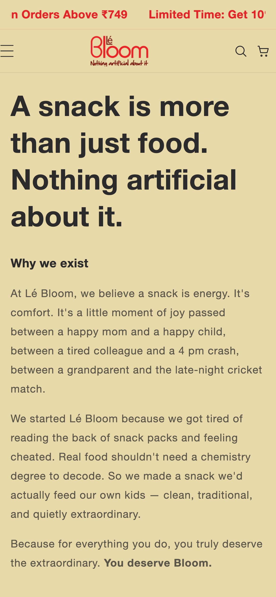
A guilt-free snack story, told with honesty and warmth
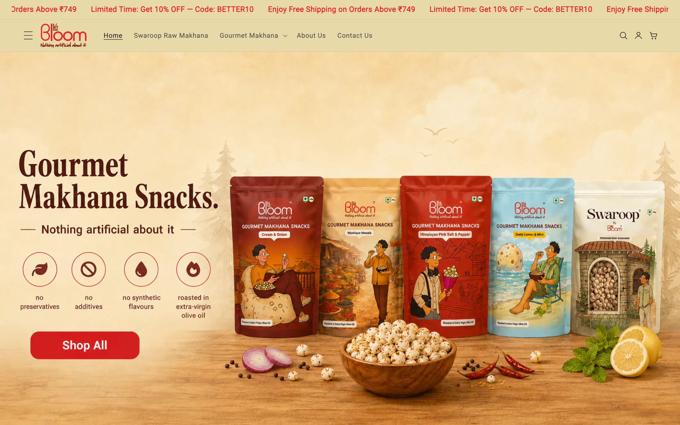
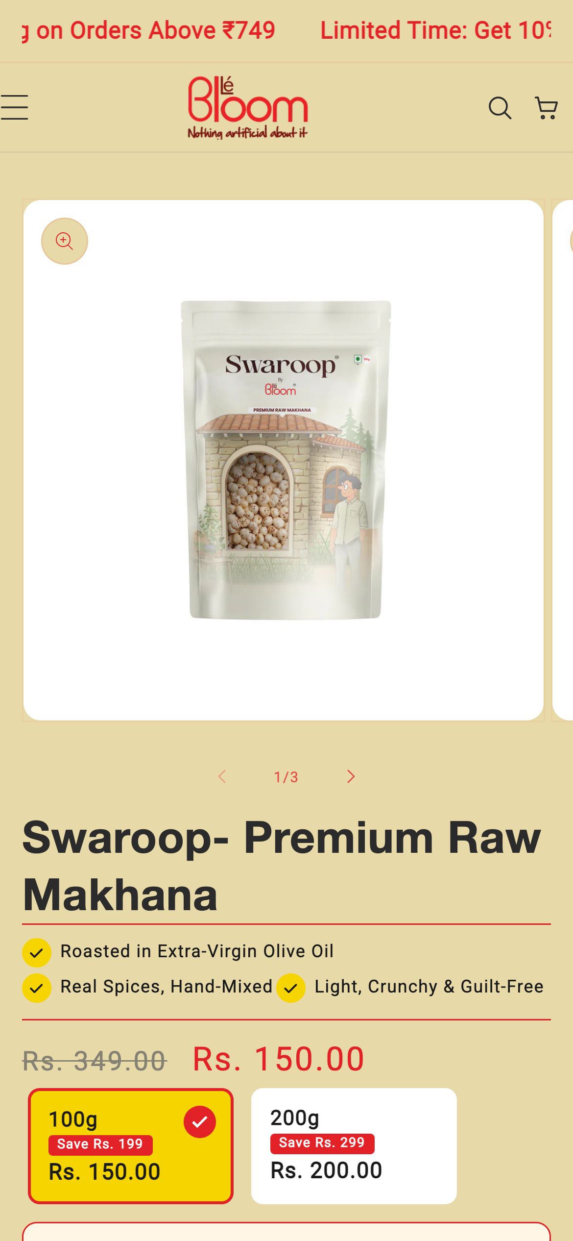
Lé Bloom makes premium makhana - hand-picked raw lotus seeds and gourmet roasted flavours, made in their own FSSAI and US-FDA facility. The store had to sell a 'nothing artificial' promise and make a healthy snack feel genuinely premium.
- Client
- Lé Bloom
- Industry
- Healthy Snacks · D2C
- Year
- 2026
- Services
- Brand-led UI Design, E-commerce Build, Product Merchandising, Front-end Development
Pages we designed & built
Not a one-page template - a full site. Here are the real, live pages we designed and developed, each with its own layout and job to do.
The brief
Healthy snacking is a crowded, claim-heavy category. The store had to cut through with honesty - a clean-label, never-deep-fried promise backed by real proof - while making makhana feel appetising and premium rather than worthy and dull.
The thinking
Honest, natural warmth
We built the palette from bloom green and warm cream with a soft lotus-pink accent - clean and natural, but appetising. It signals the wholesome promise while making the snack feel like a treat, not a supplement.
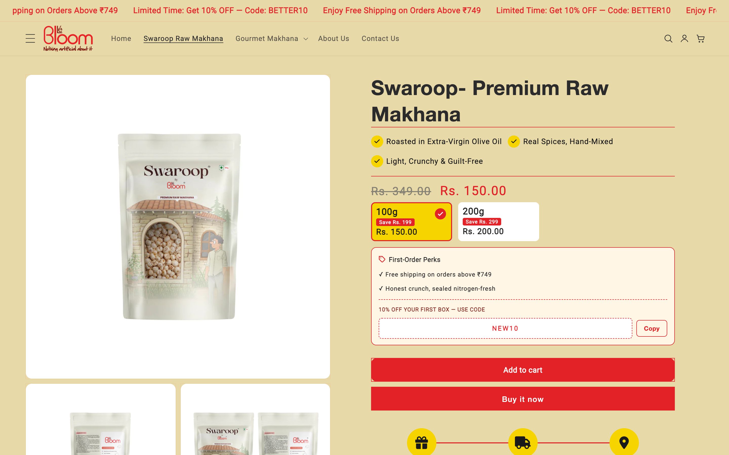
Proof you can trust
FSSAI and US-FDA approval, the own-facility story and 'never deep-fried, roasted in olive oil' are surfaced as headline proof, so a careful shopper believes the clean-label claim instantly.
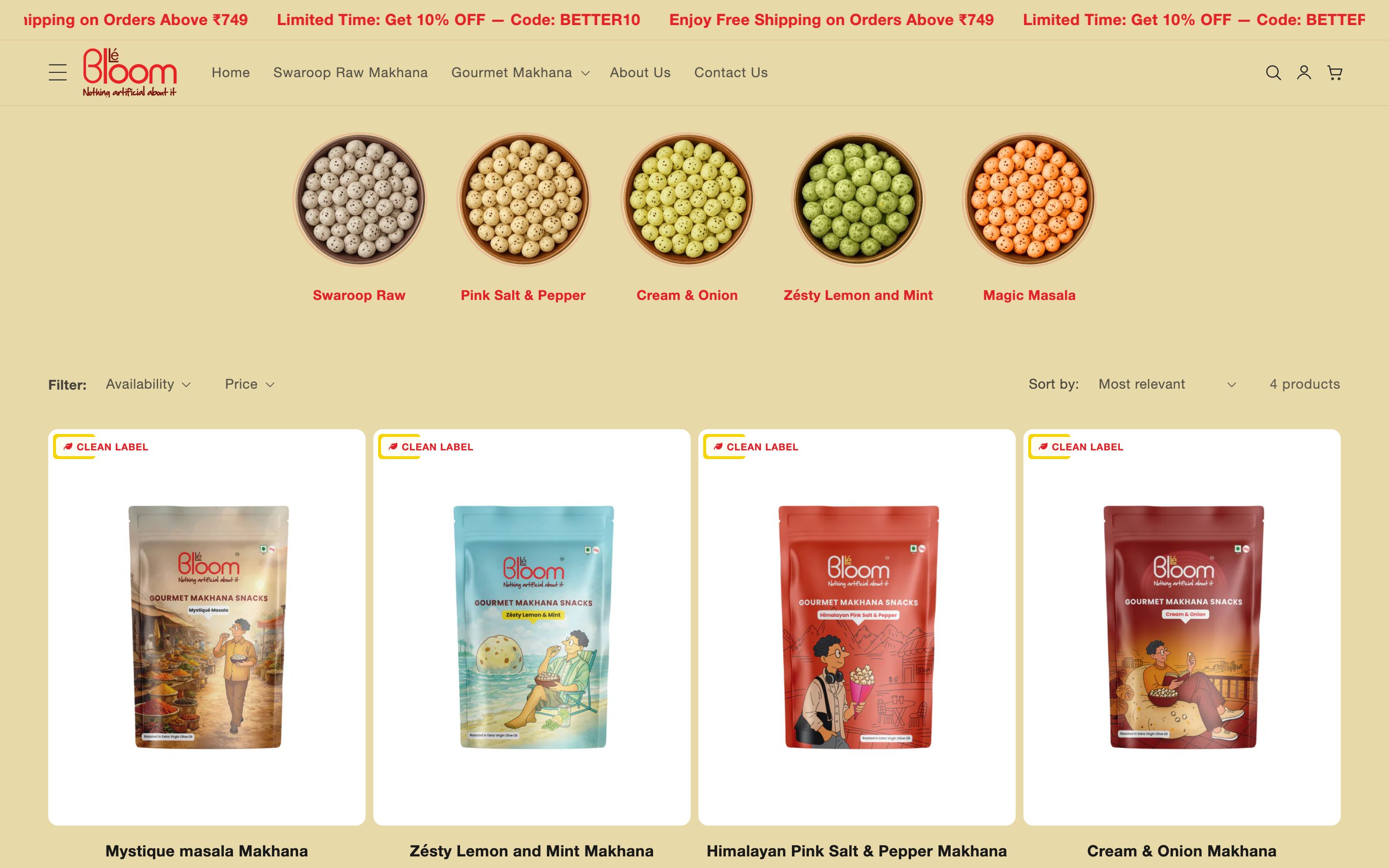
Flavour-first merchandising
Gourmet flavours are presented with appetising, colour-coded clarity, and gifting and combo packs are merchandised up front for festivals and corporate buyers.
Colour & meaning
Every colour was chosen for a reason - what it signals to the visitor and how it makes them feel before they read a single word.
Natural, wholesome goodness - the colour of the clean-label, guilt-free promise at the brand's core.
A soft, appetising accent drawn from the lotus, adding warmth so healthy never reads as bland.
A warm, natural background that keeps the store feeling pure, fresh and premium.
A deep, warm ink for type that feels honest and editorial rather than clinical.
Built for every screen
Designed mobile-first and engineered to look sharp on every device - the same live site on desktop, tablet and phone.
And every page is tuned for the phone - where most of these visitors actually land.
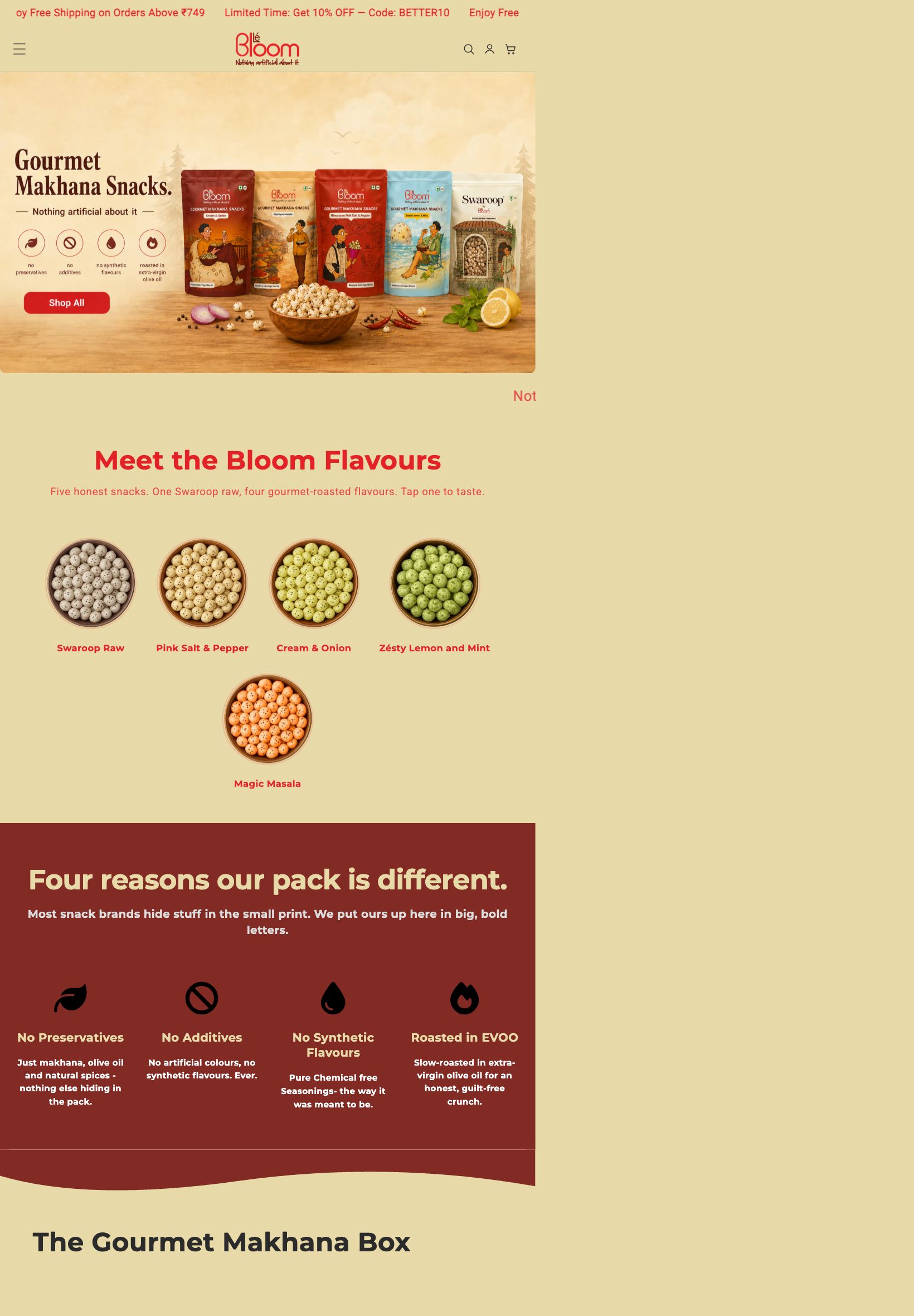
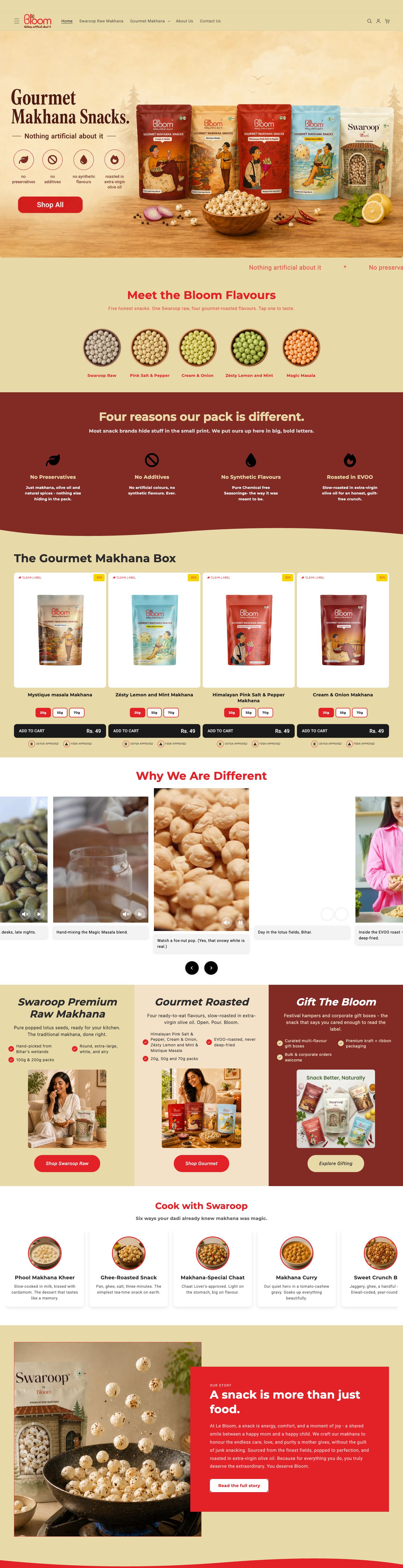
Home
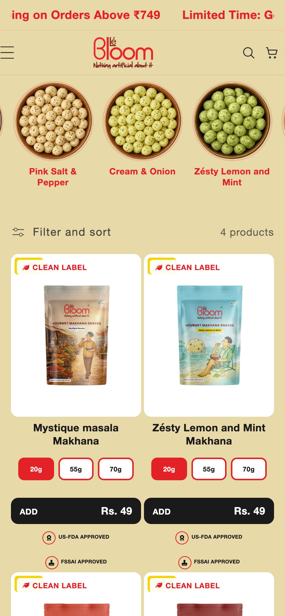
Collection
Product
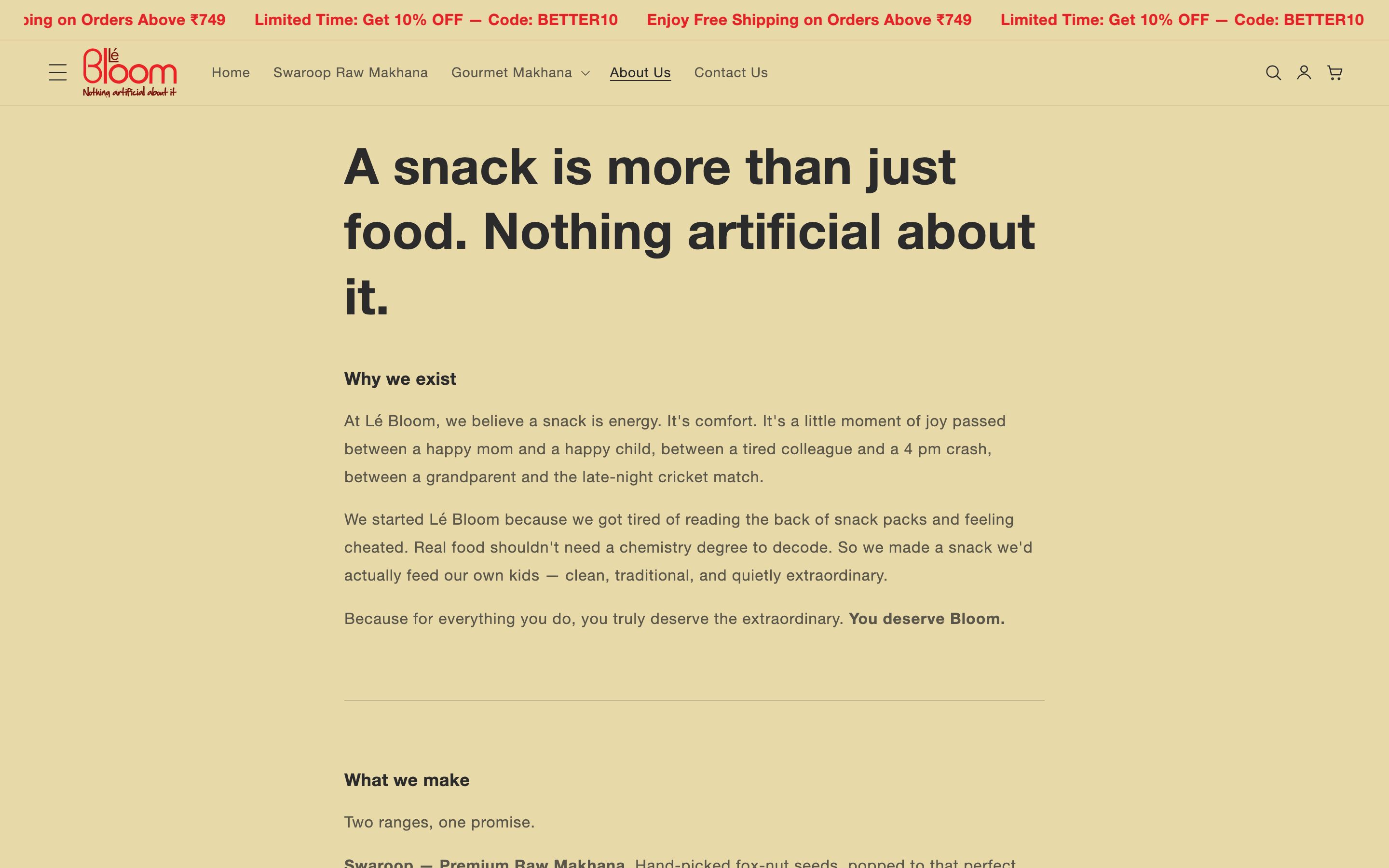
About
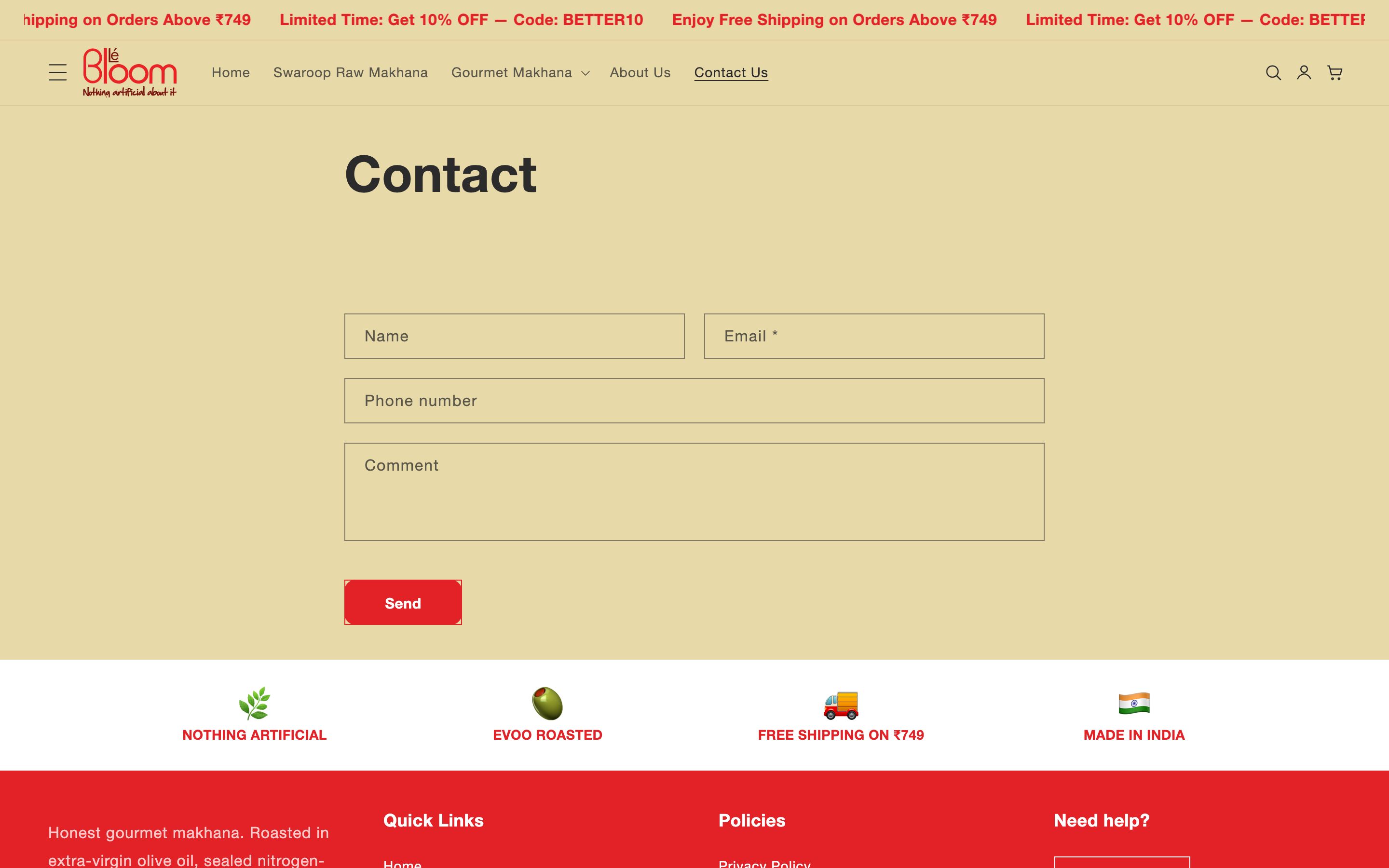
Contact
The full homepage, top to bottom
The complete homepage we shipped - scroll inside the frame to see every section, exactly as it went live.
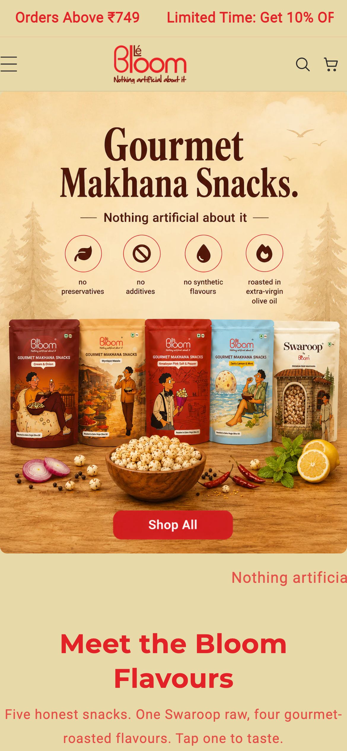
Homepage on mobile
What we shipped
Pages shipped
“The store finally tells our honest story as clearly as we live it. Shoppers see the proof, the snack looks as good as it tastes, and they buy makhana as a premium treat - not just a healthy compromise.”