Shalby Hospitals
One calm, accessible system that ties 16 hospitals and 11 specialties together
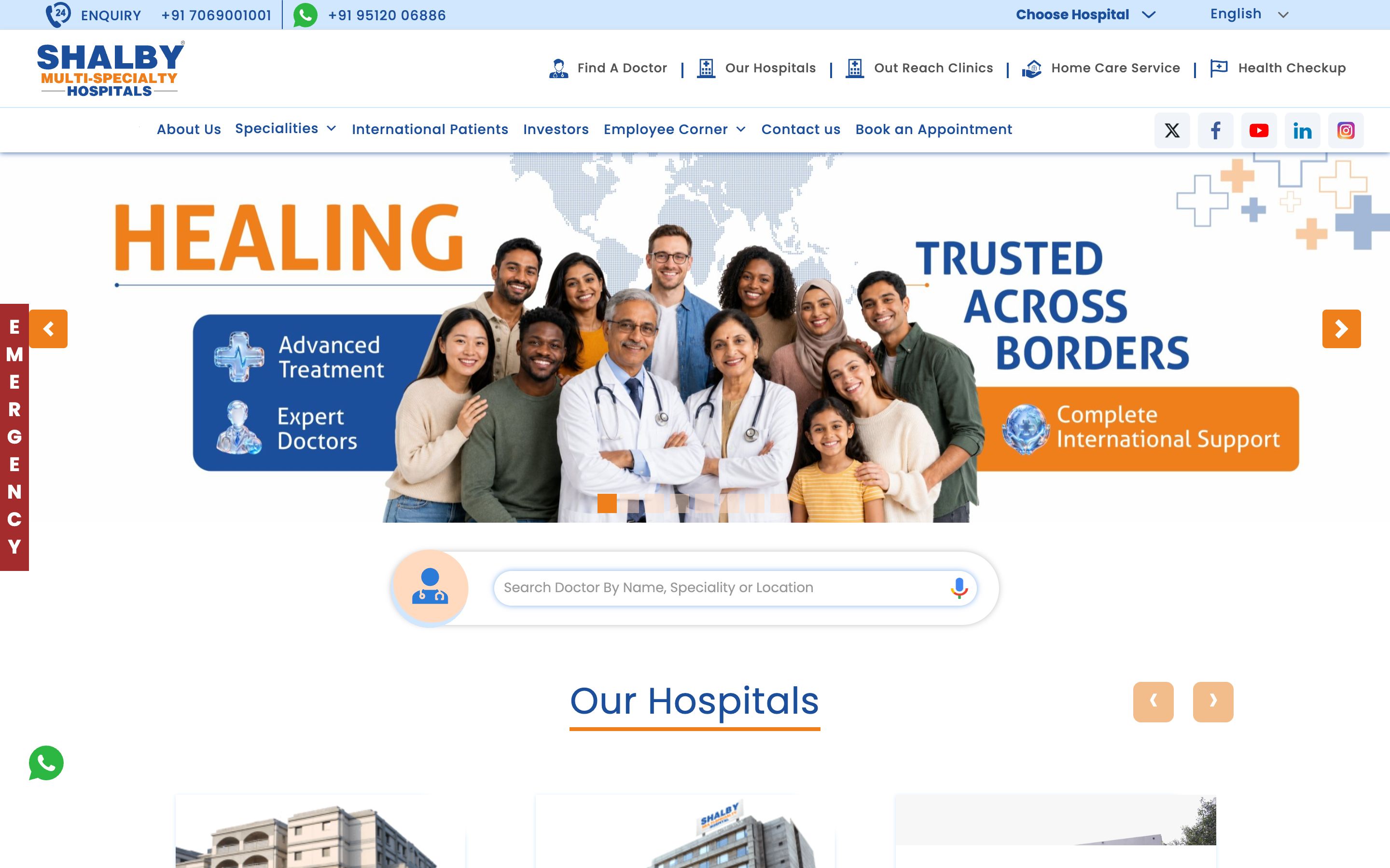
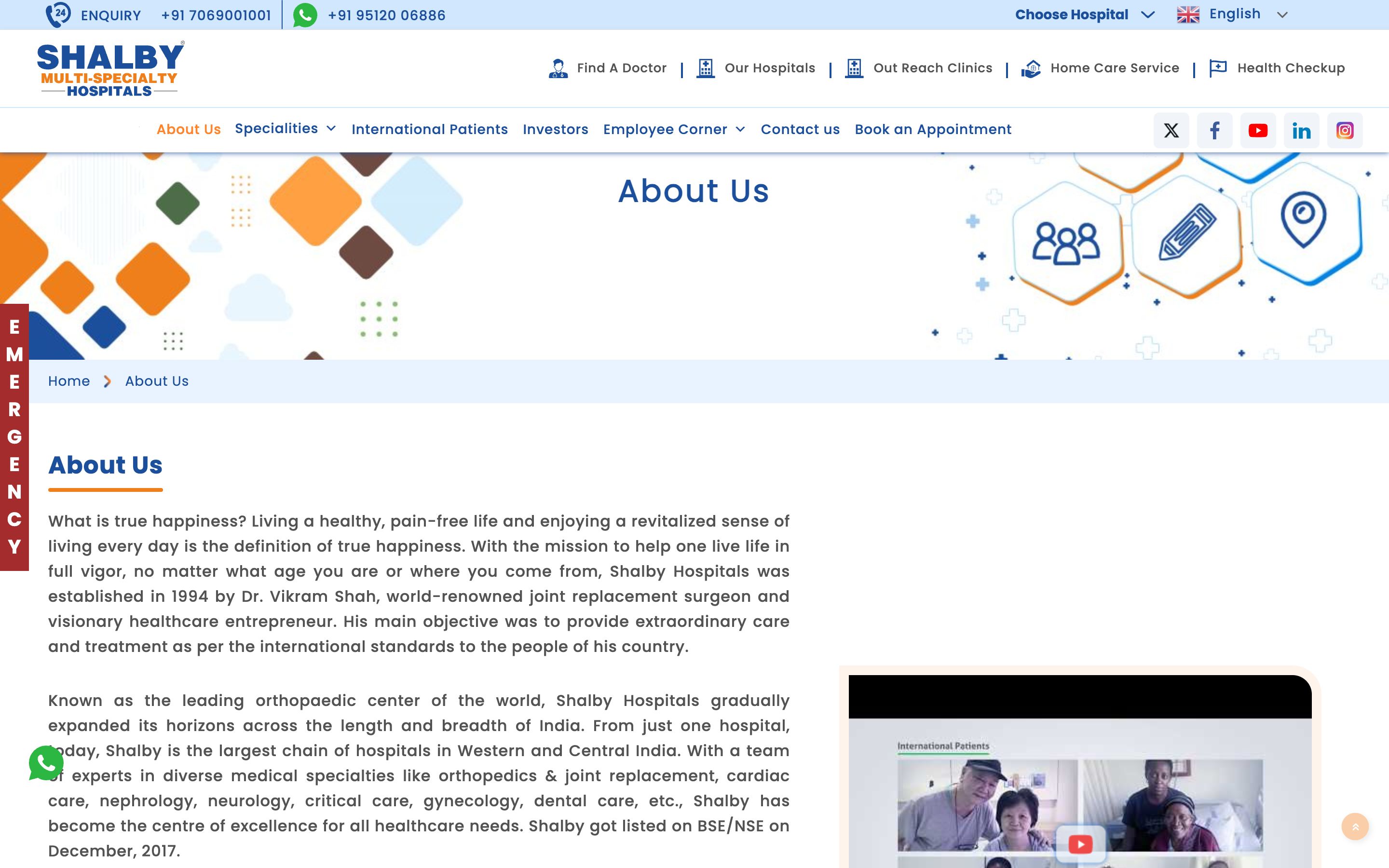
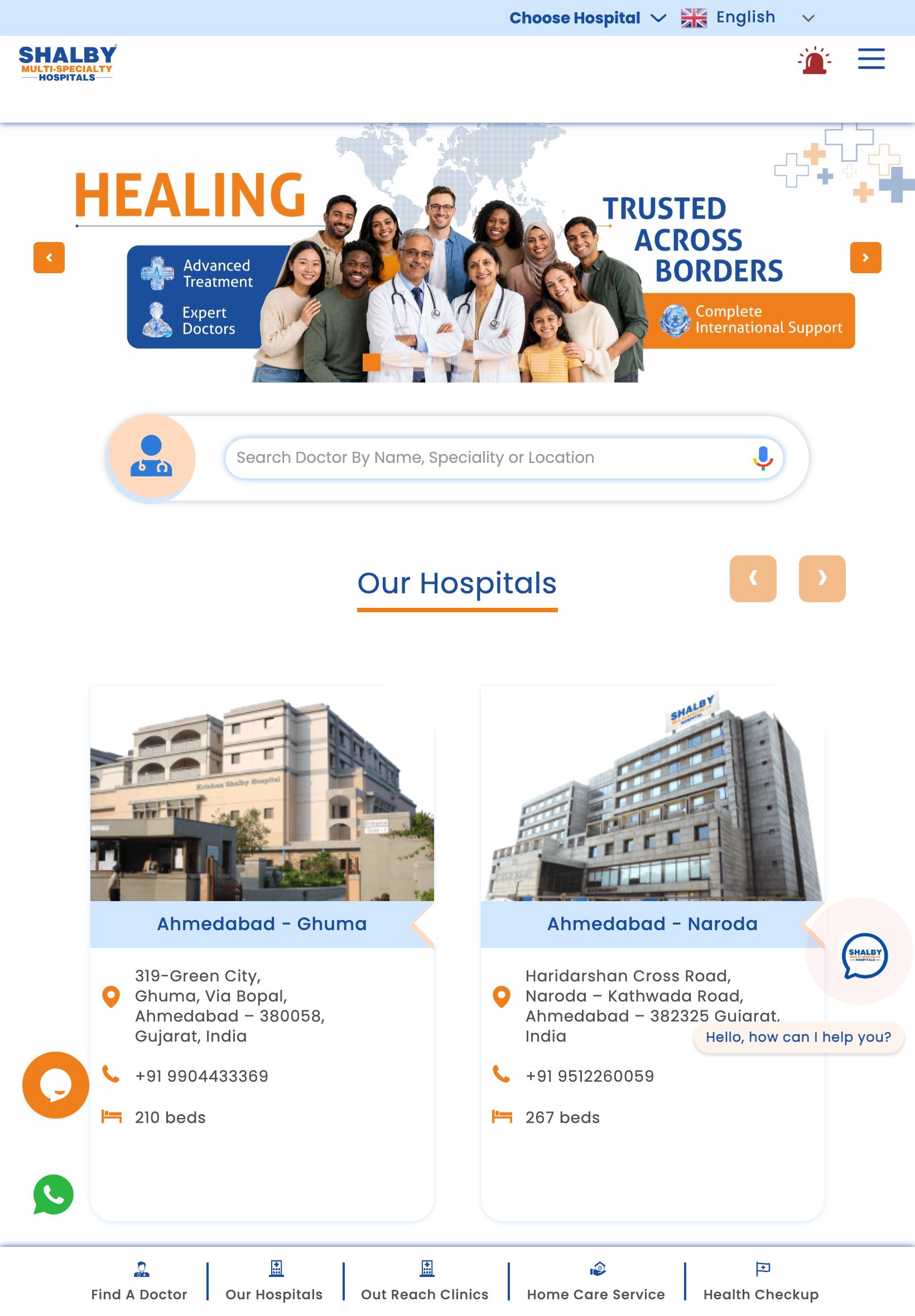
Shalby has cared for 2.8 million+ patients since 1994 across 16 facilities. The site had to make a sprawling, multi-location, multi-specialty network feel like one reassuring brand - and help an anxious patient find the right doctor in seconds.
- Client
- Shalby Hospitals
- Industry
- Healthcare
- Year
- 2026
- Services
- UX & Information Architecture, UI Design, Front-end Development, Accessibility
Pages we designed & built
Not a one-page template - a full site. Here are the real, live pages we designed and developed, each with its own layout and job to do.
The brief
A large hospital website lives or dies on one moment: a worried person, often on a phone, trying to find the right specialist, location or appointment fast. The old experience buried that journey under a maze of departments, cities and PDF-style pages.
The thinking
Warm orange over clinical blue
Most hospitals hide behind cold blues. We led with Shalby's orange - the colour of energy, warmth and approachable care - and anchored it on a deep navy that signals expertise and a 32-year legacy. The result feels human first, clinical second.
Two-tap patient journeys
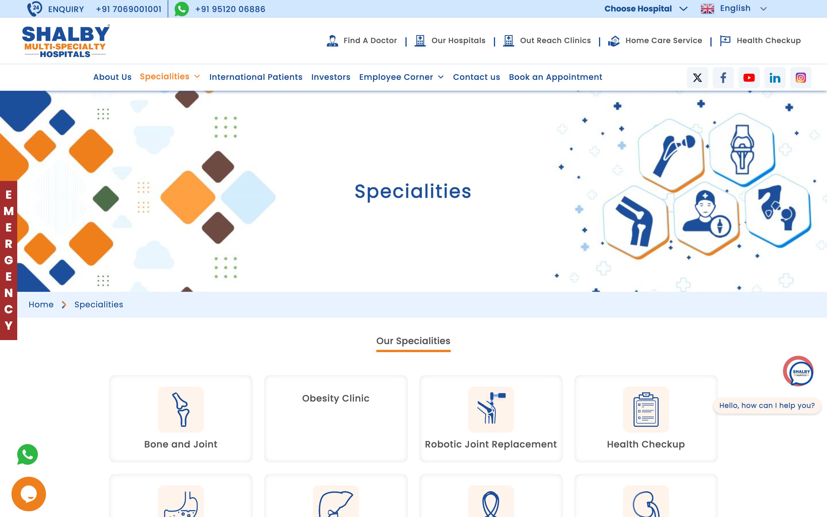
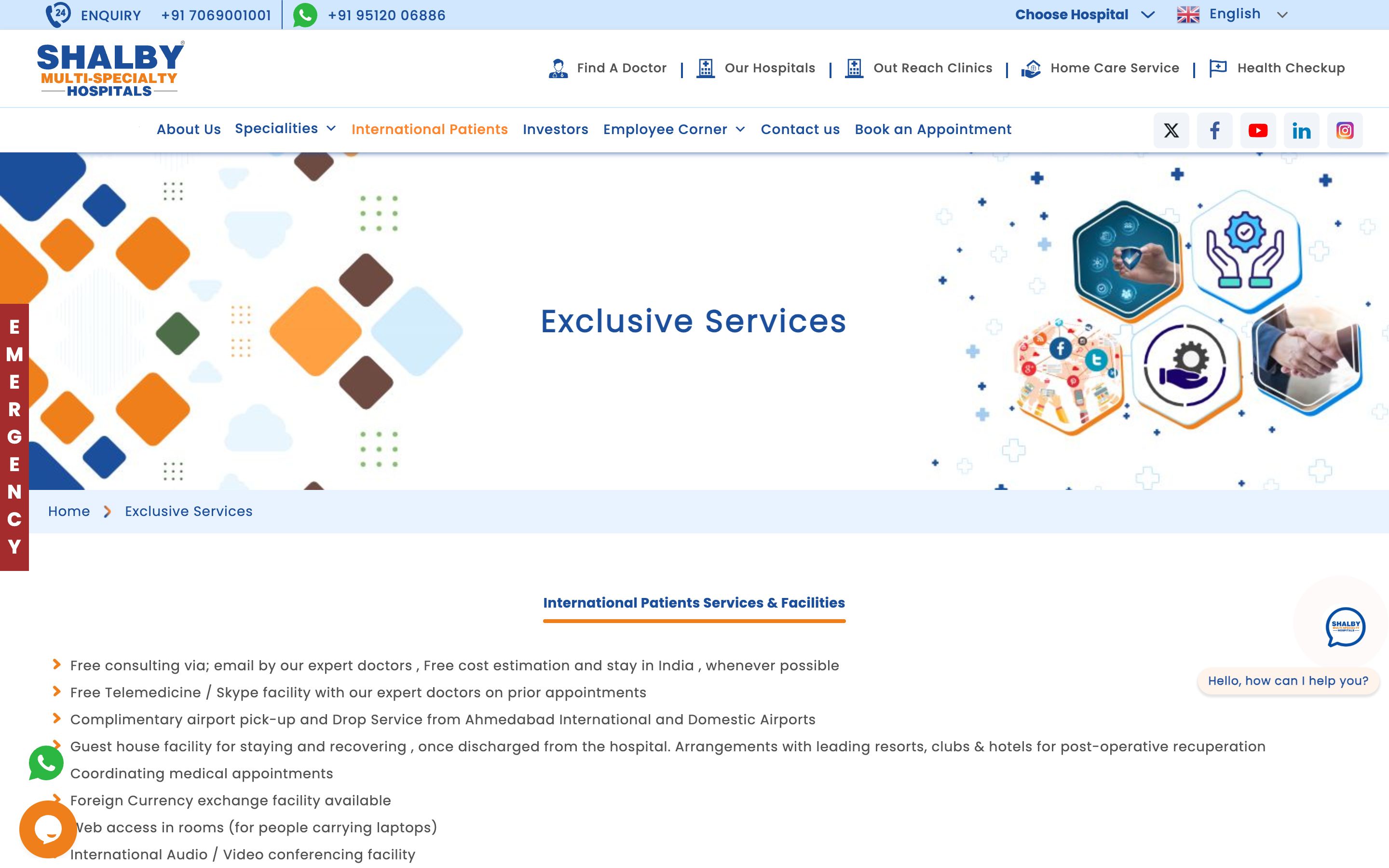
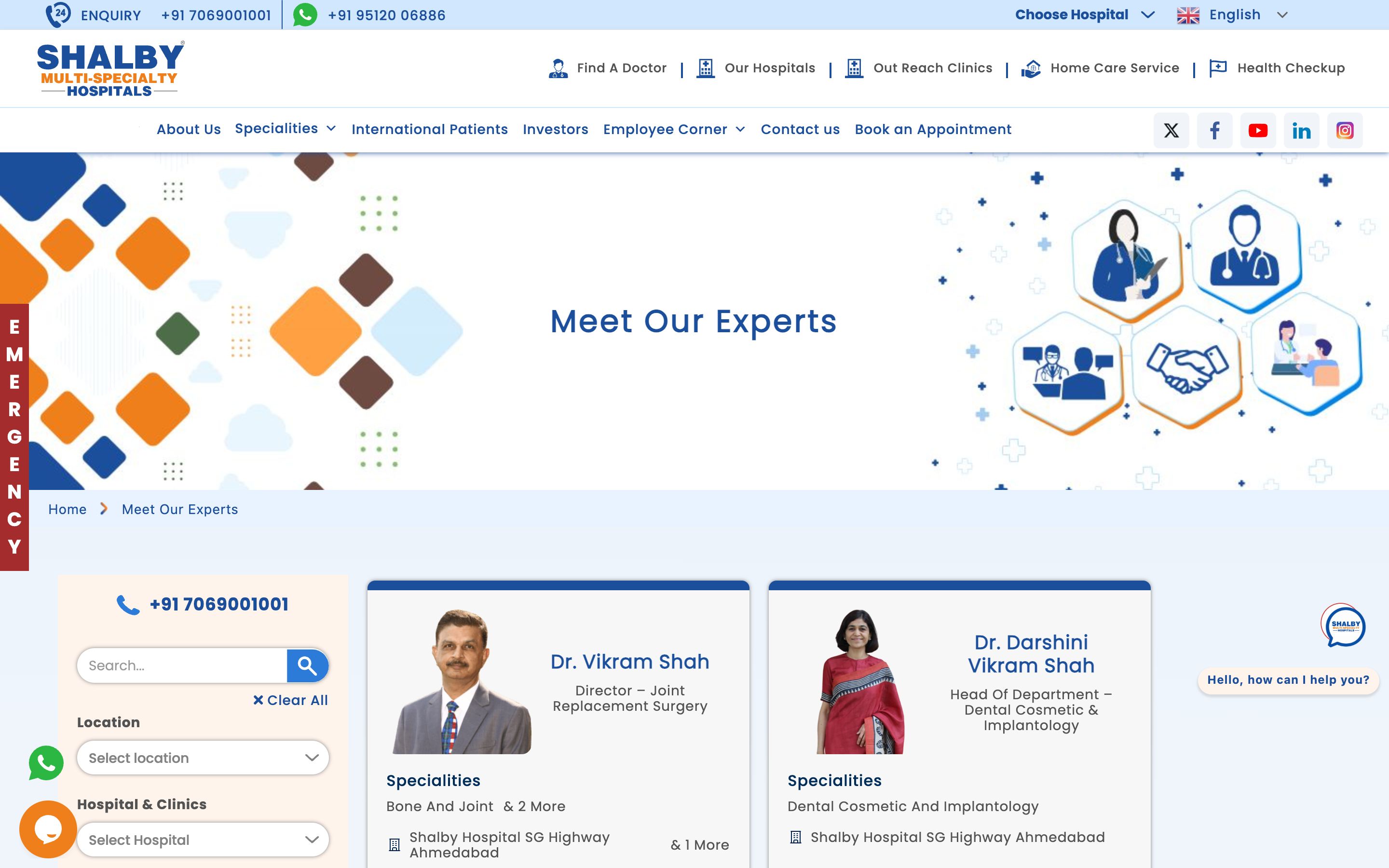
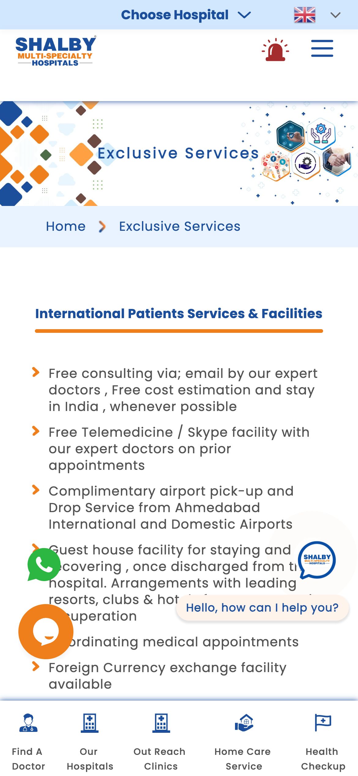
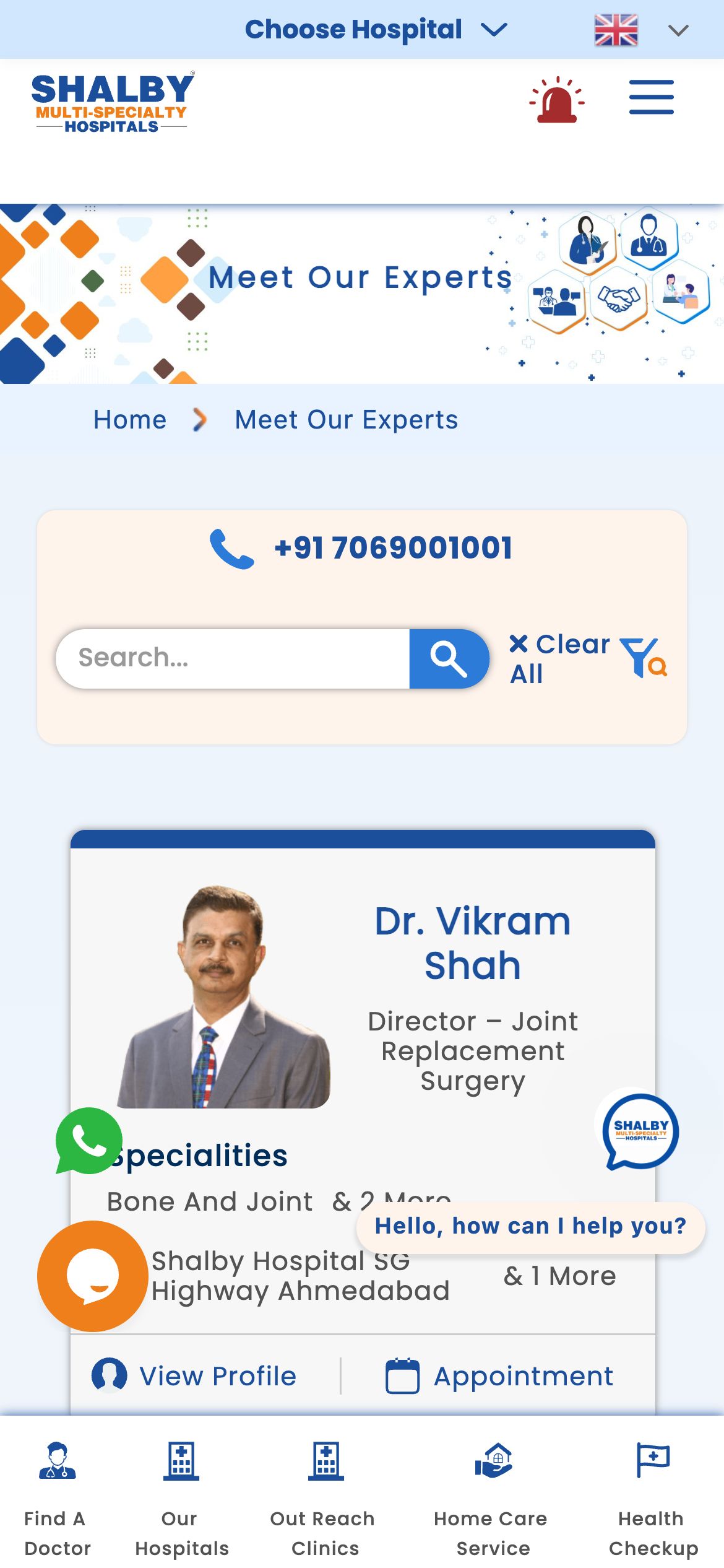
Find a doctor, book an appointment and video-consult are pinned as primary actions on every screen. Specialties and locations are organised so an anxious patient reaches the right page in seconds, not minutes.
Accessible by default
Large, high-contrast type, generous spacing and WCAG-AA colour pairings so the site works for every age group and on every device - including older patients reading on a phone in a waiting room.
Colour & meaning
Every colour was chosen for a reason - what it signals to the visitor and how it makes them feel before they read a single word.
Warmth and approachable care - the human, reassuring face of the brand that sets it apart from cold hospital blues.
Depth, expertise and the 32-year legacy - it grounds the orange and signals clinical authority.
A calm secondary used for wellness, prevention and supportive content.
Clean, airy backgrounds that keep dense medical information readable and stress-free.
Built for every screen
Designed mobile-first and engineered to look sharp on every device - the same live site on desktop, tablet and phone.
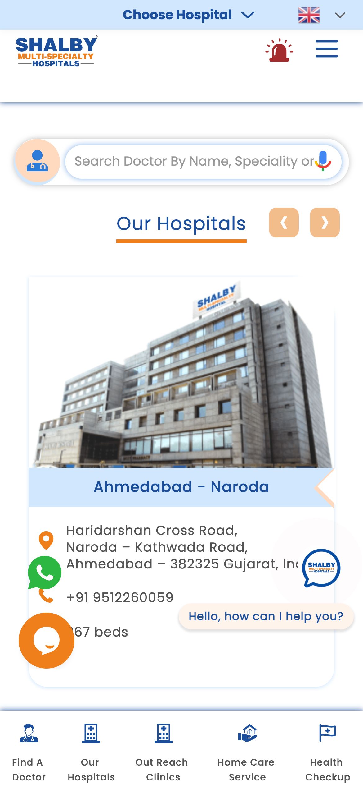
And every page is tuned for the phone - where most of these visitors actually land.
Home
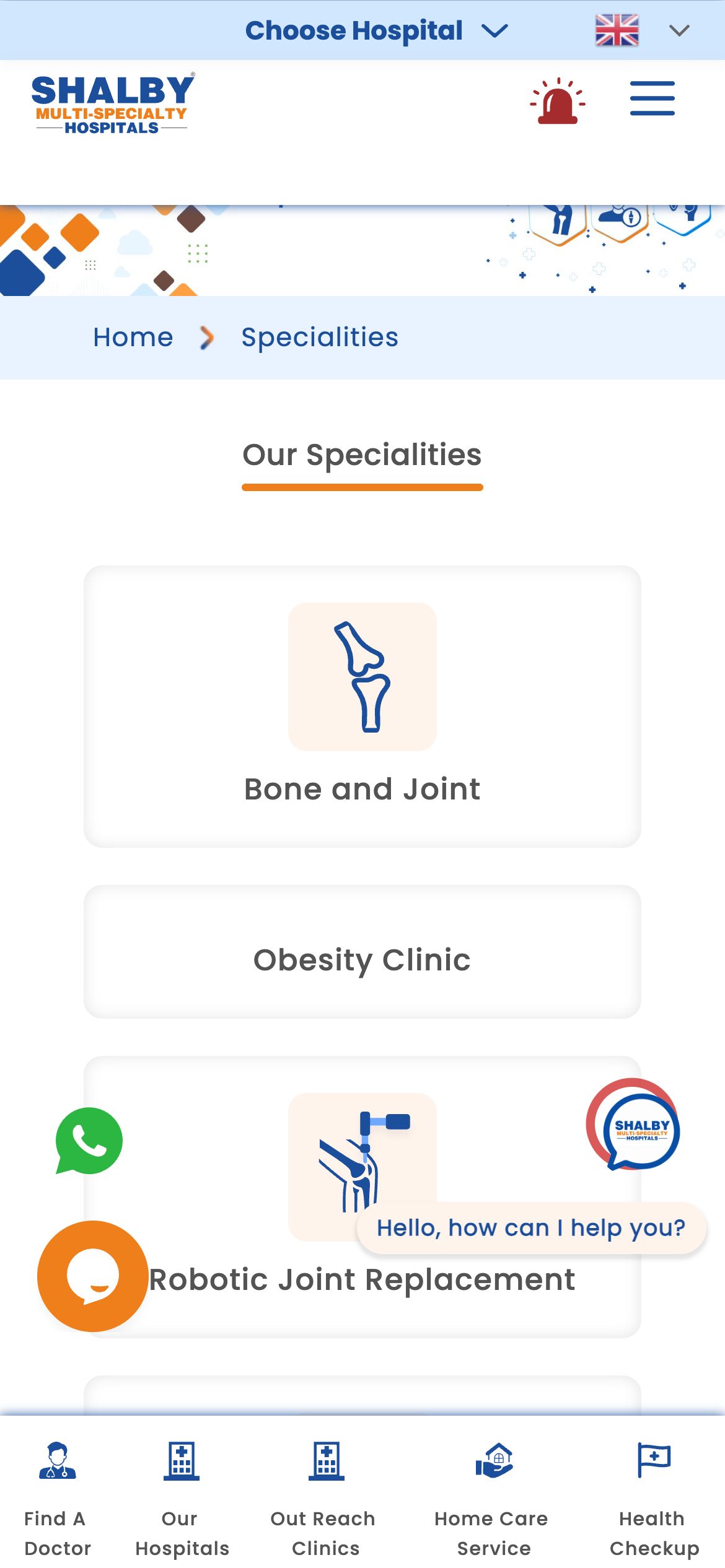
Specialities
Services
Doctors
About
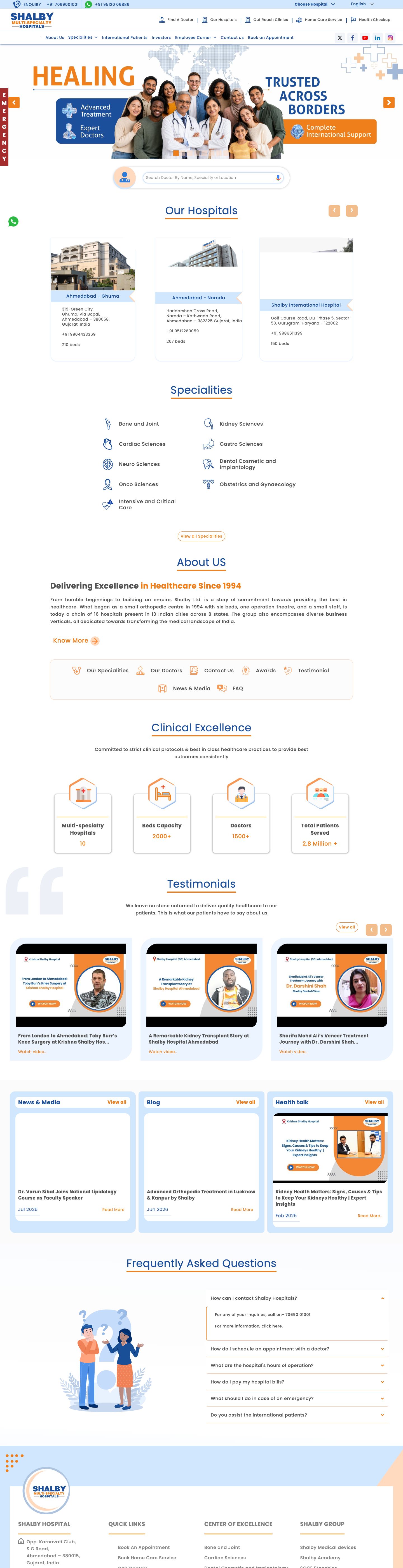
The full homepage, top to bottom
The complete homepage we shipped - scroll inside the frame to see every section, exactly as it went live.
Homepage on mobile
What we shipped
Pages shipped
“The new site finally feels like one Shalby, no matter which hospital or city you start from. Patients reach the right doctor far faster, and it reads beautifully on a phone.”