SJK Architects
An editorial portfolio where the architecture, not the interface, does the talking
SJK Architects is a 35-year Mumbai practice with Prix Versailles and AD100 work. The site had to feel as considered as their buildings - restrained, generous and built entirely around large-format project photography.
- Client
- SJK Architects
- Industry
- Architecture
- Year
- 2026
- Services
- Art Direction, UI Design, Front-end Development, CMS
Pages we designed & built
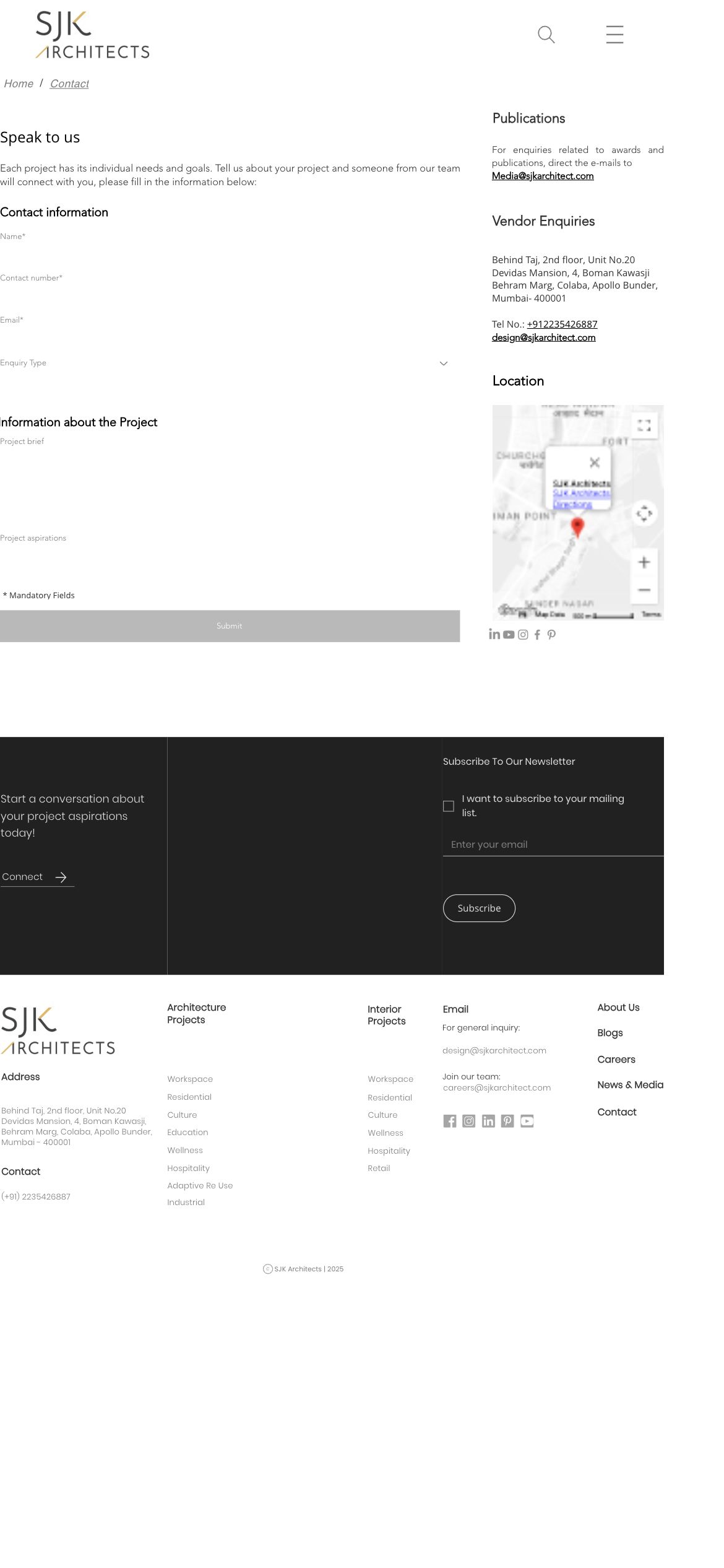
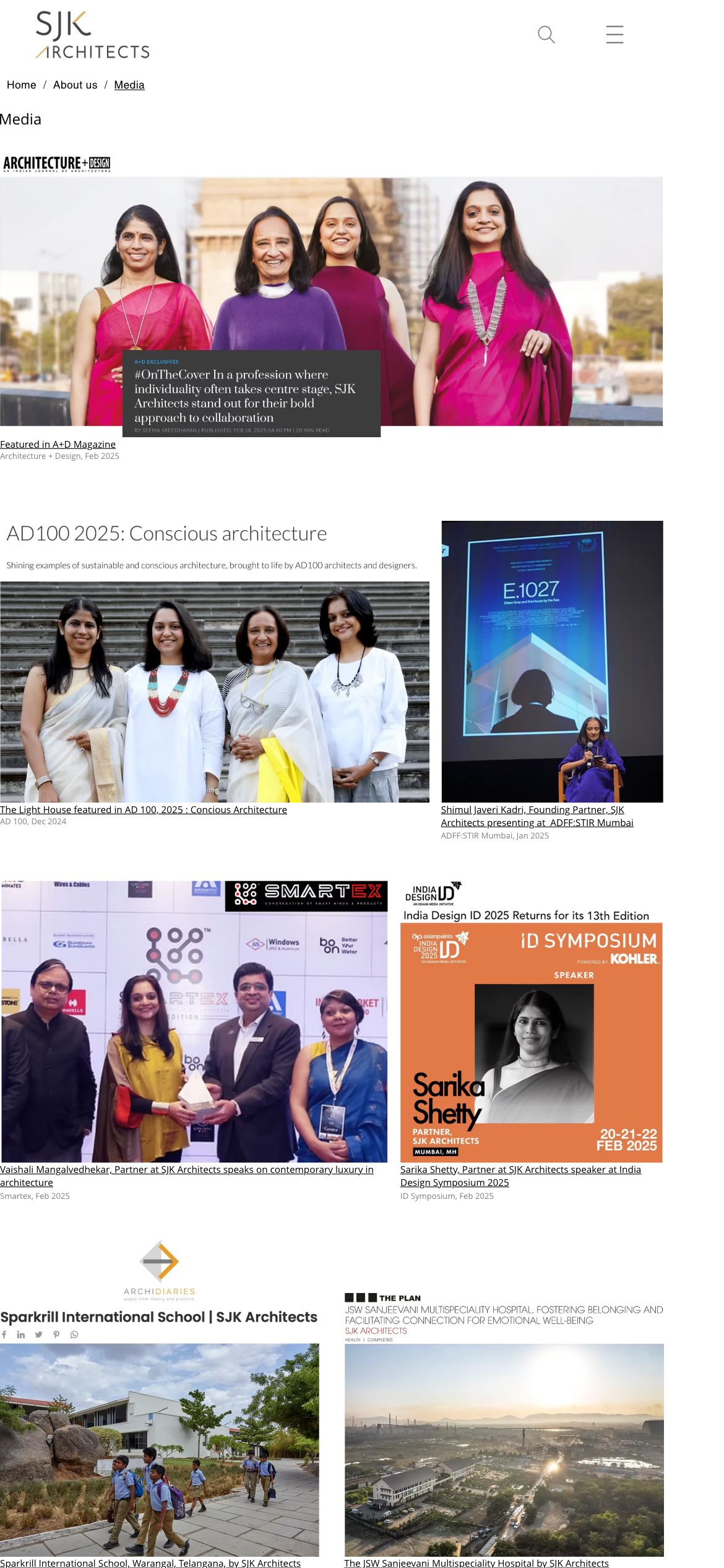
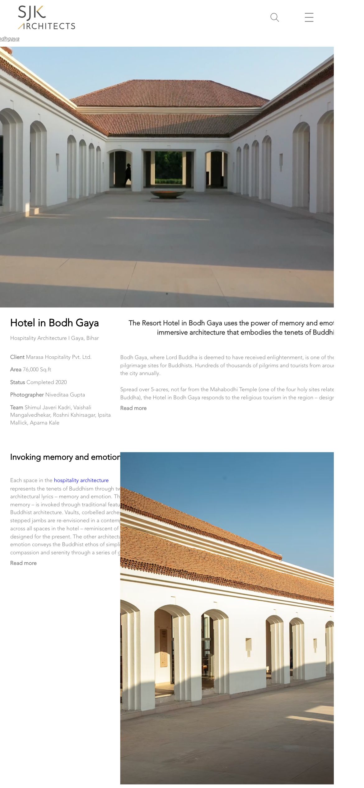
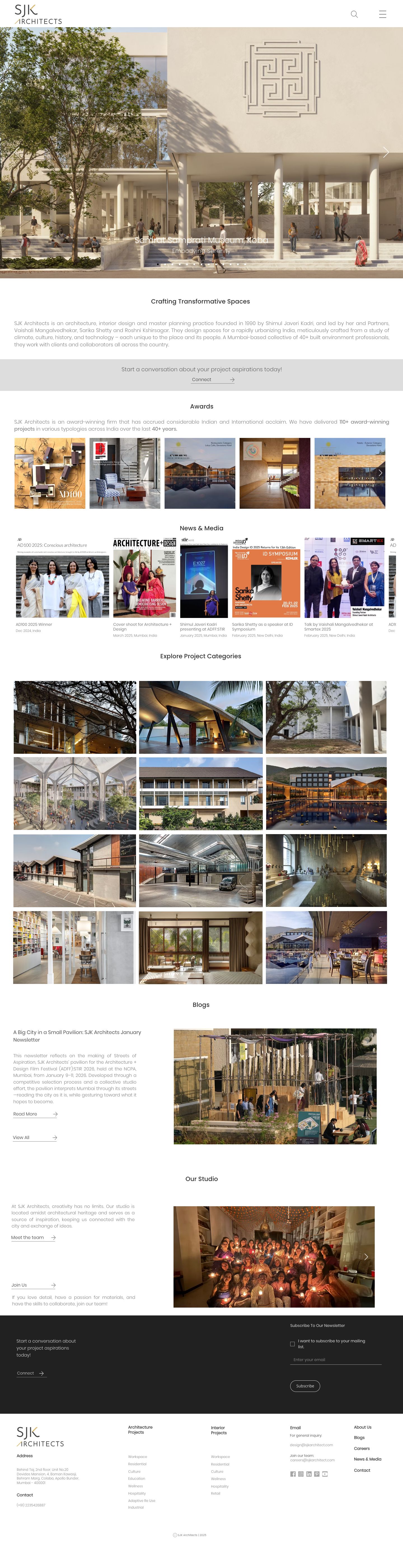
Not a one-page template - a full site. Here are the real, live pages we designed and developed, each with its own layout and job to do.
The brief
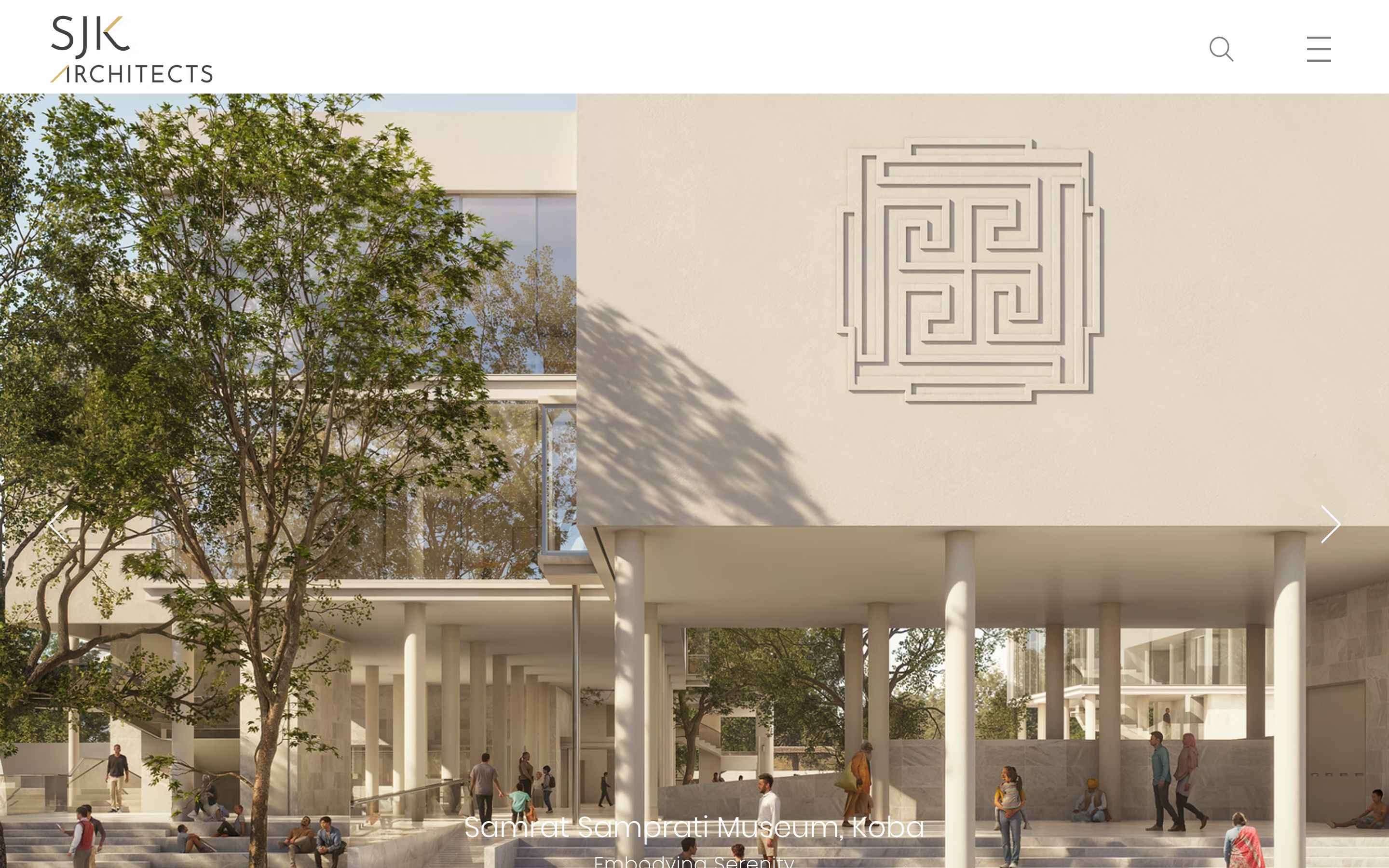
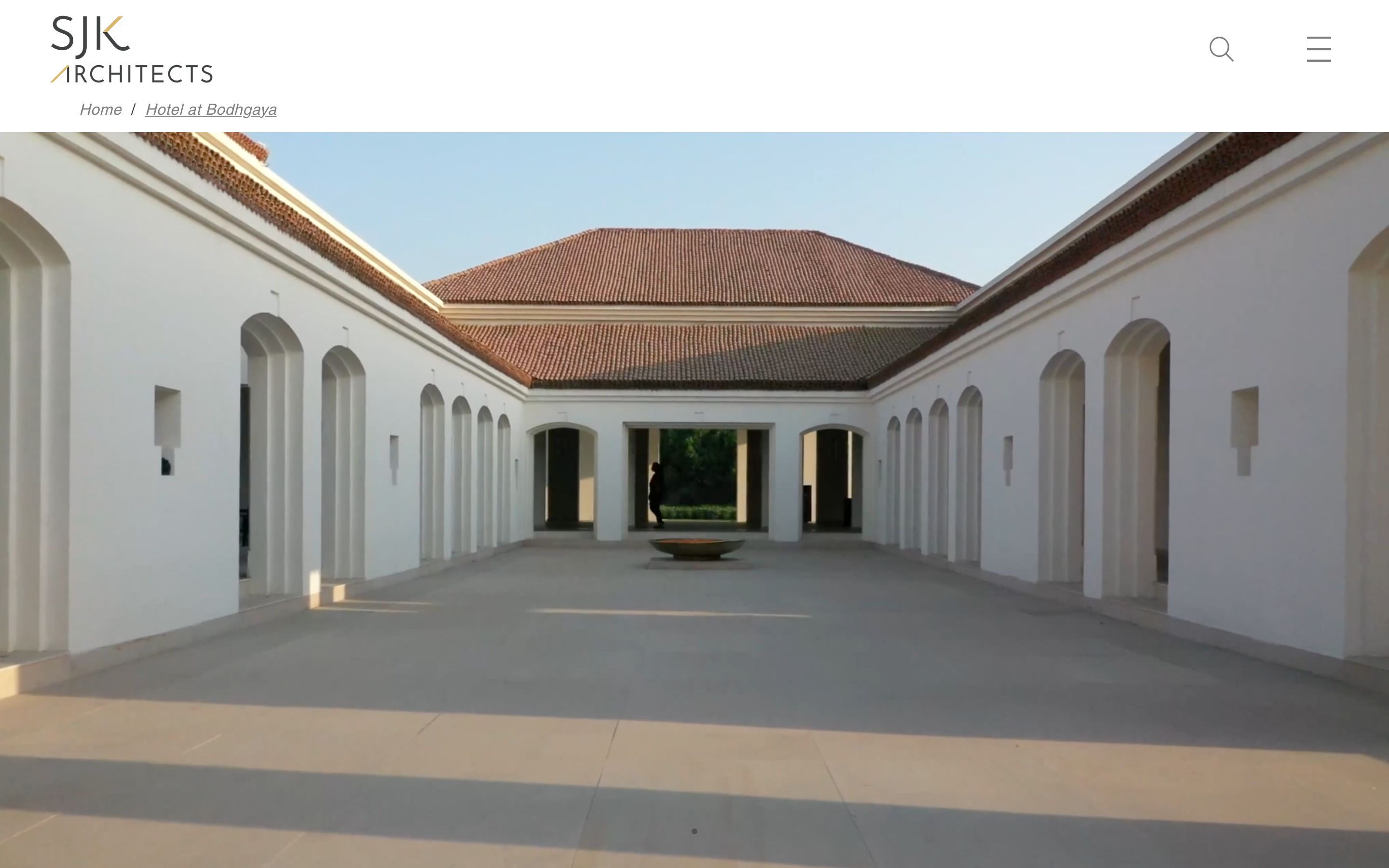
An award-winning architecture firm is judged on the quality of its work and the taste of its presentation. The site is effectively a gallery, and any loud interface, clutter or trend would have cheapened a 35-year reputation.
The thinking
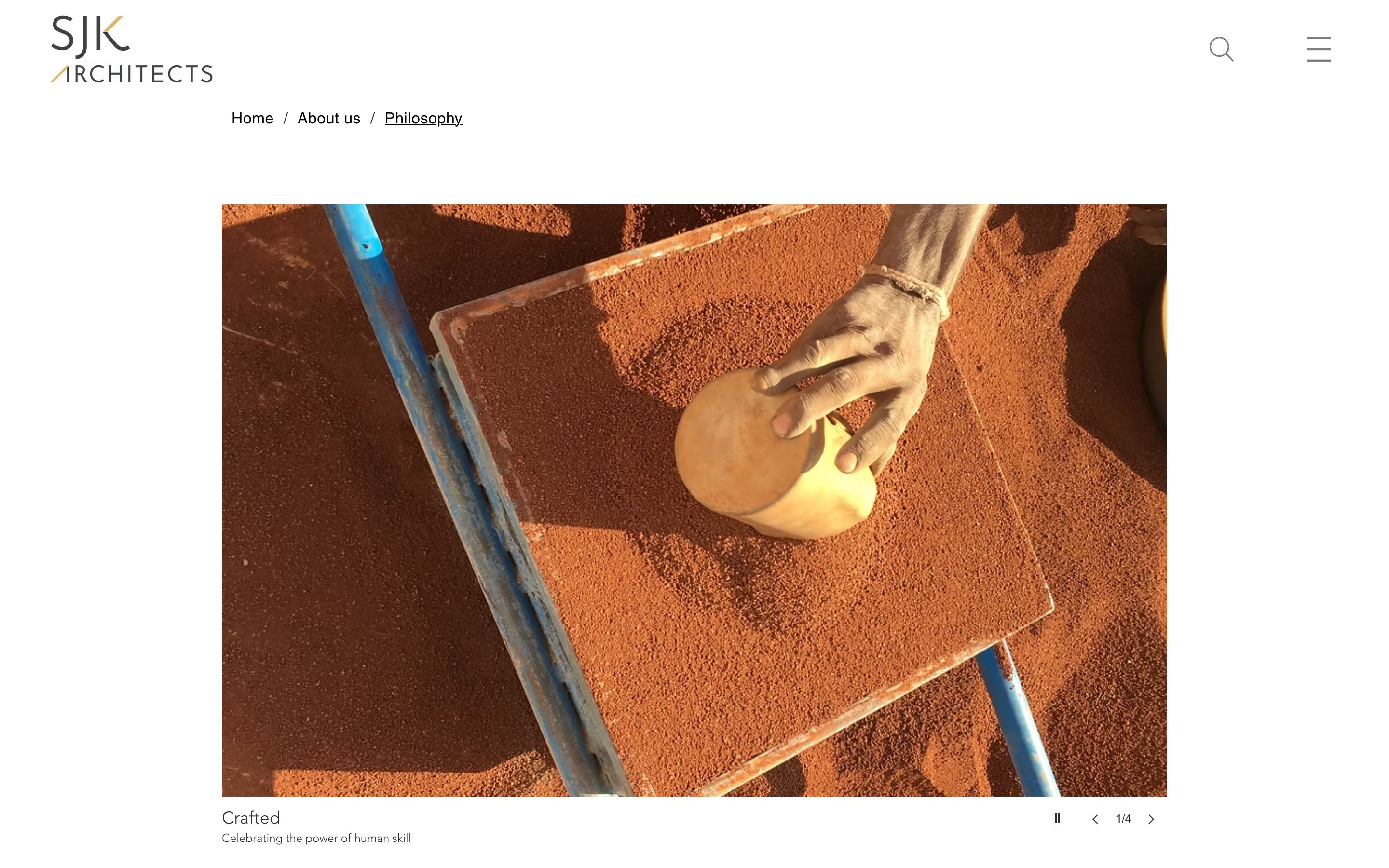
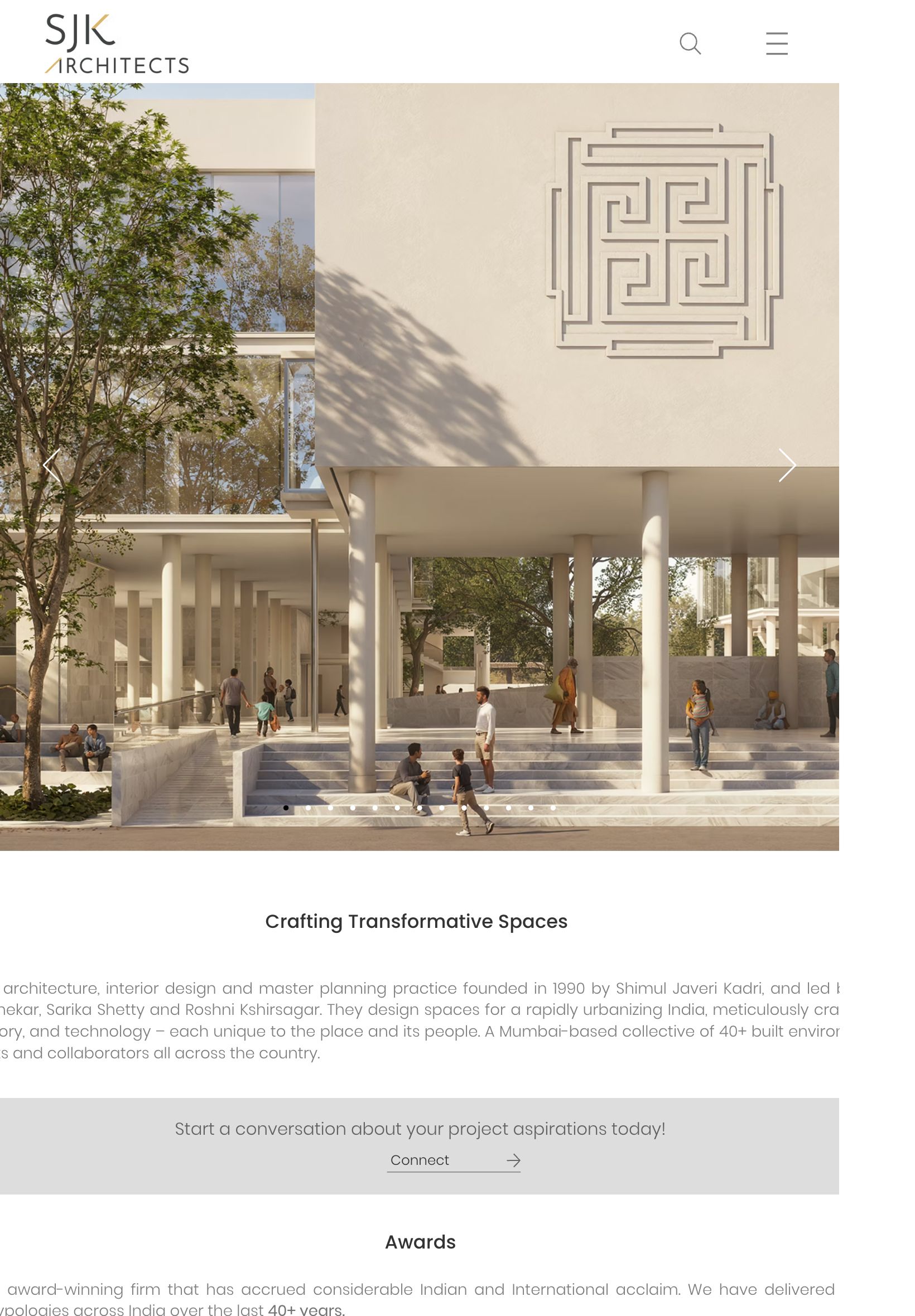
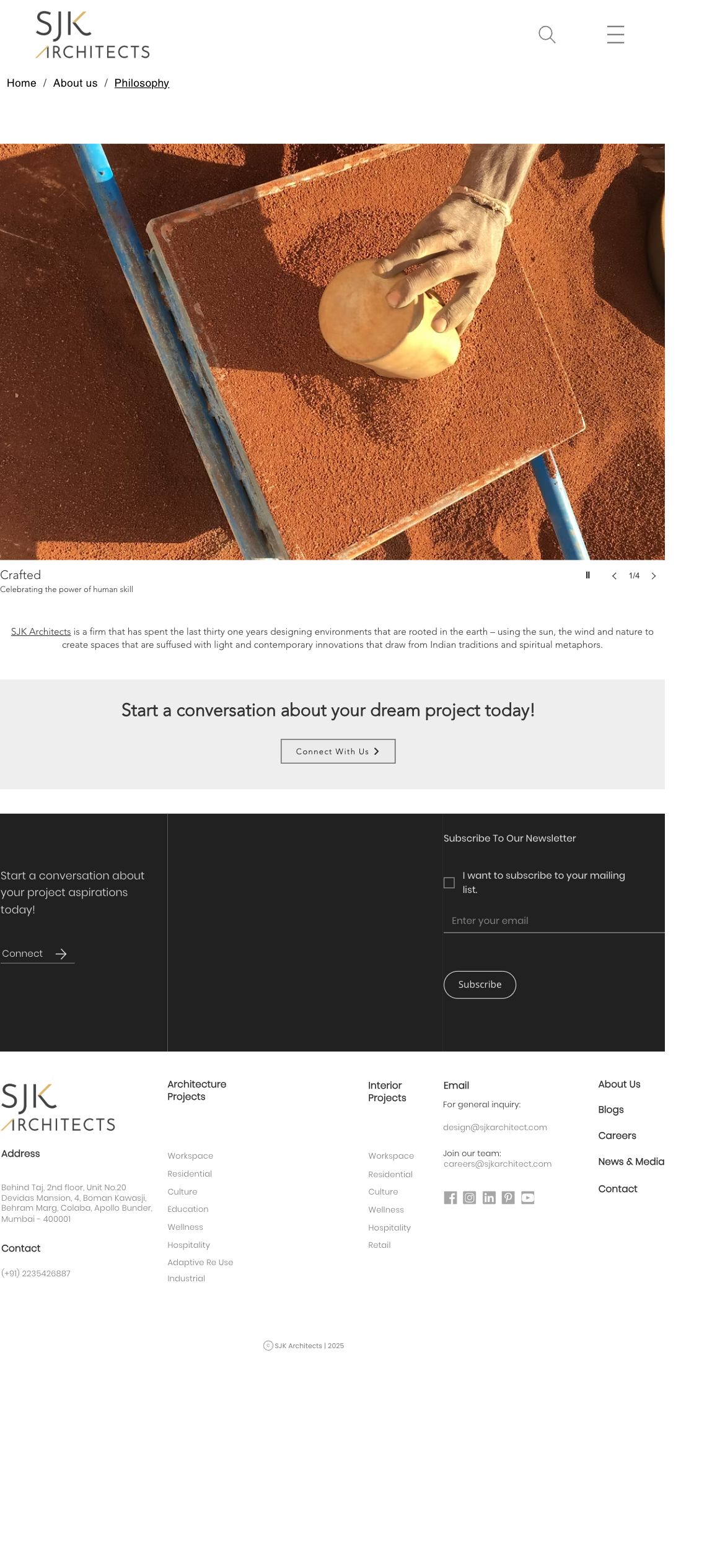
A neutral canvas for the work
We stripped the interface back to charcoal type on warm paper so the architecture photography is the only thing that shouts. Generous whitespace and a strict grid make even a dense portfolio feel calm and curated.
Gold as the single accent
One restrained gold detail - the firm's craft and its awards - threads through links and dividers. Used sparingly, it reads as premium rather than decorative.
Editorial typography
A large, confident serif for project titles paired with a quiet sans for captions gives the site the rhythm of an architecture monograph, not a brochure.
Colour & meaning
Every colour was chosen for a reason - what it signals to the visitor and how it makes them feel before they read a single word.
Quiet, architectural ink - present without competing with the photography it frames.
A soft, gallery-wall background that makes images feel mounted and considered.
A single premium accent for the firm's craft and award pedigree - used with restraint.
Captions and metadata that stay legible but never pull focus from the work.
Built for every screen
Designed mobile-first and engineered to look sharp on every device - the same live site on desktop, tablet and phone.
And every page is tuned for the phone - where most of these visitors actually land.
Home
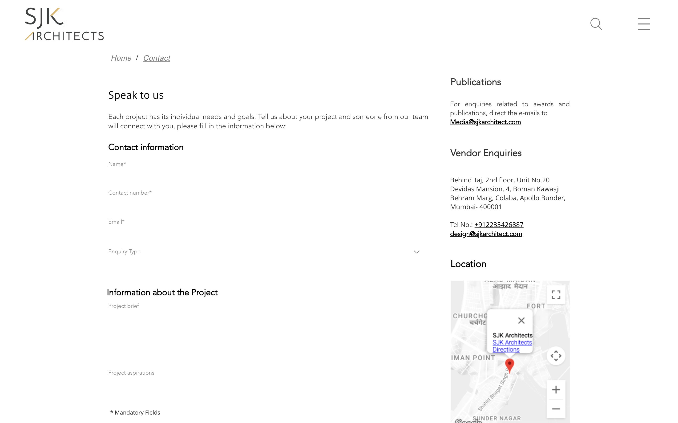
About
Contact
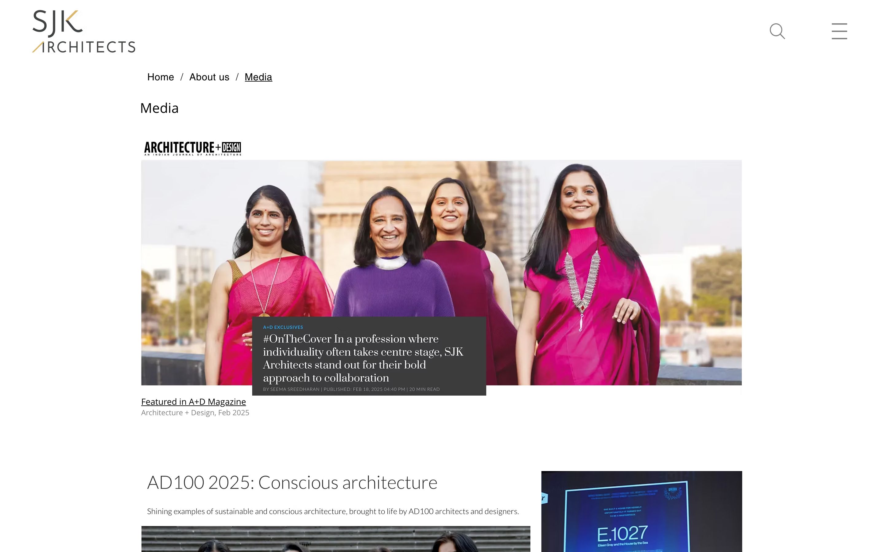
Blog
Page
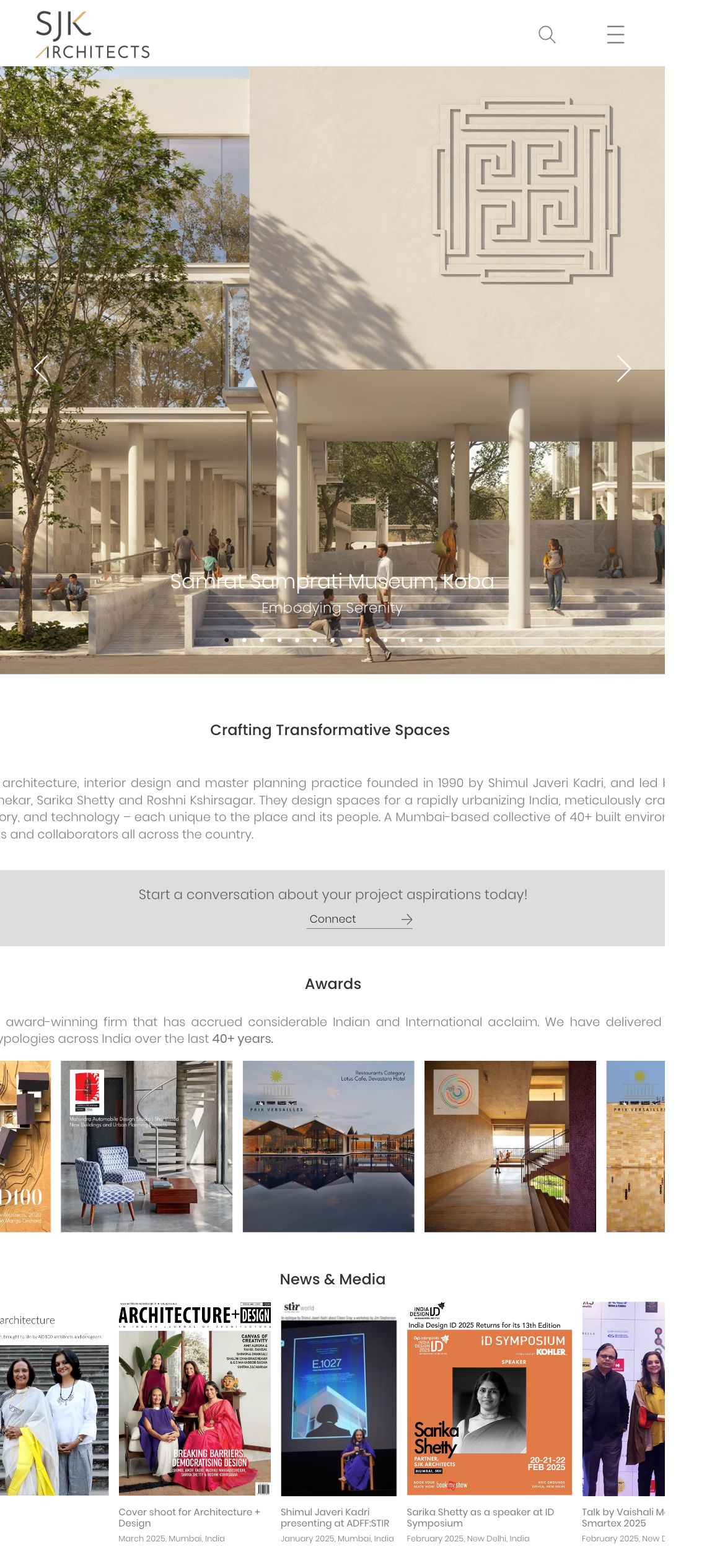
The full homepage, top to bottom
The complete homepage we shipped - scroll inside the frame to see every section, exactly as it went live.
Homepage on mobile
What we shipped
Pages shipped
“It feels like our work, not a template. The restraint is the point - the buildings lead, the site simply frames them. Exactly the impression we want to leave.”