Zinarch
A near-monochrome storefront that makes premium fixtures feel like gallery pieces
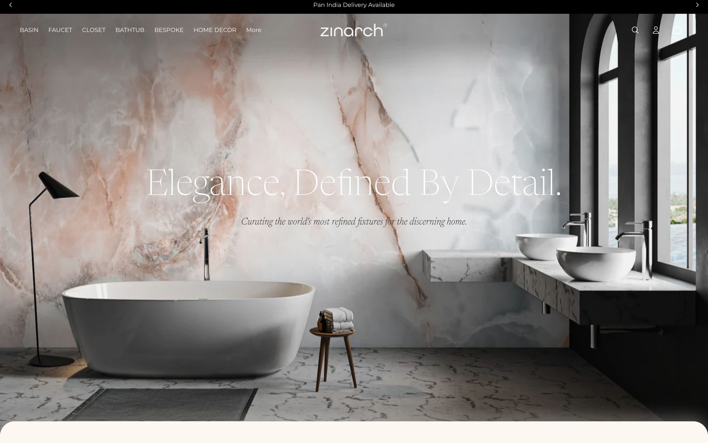
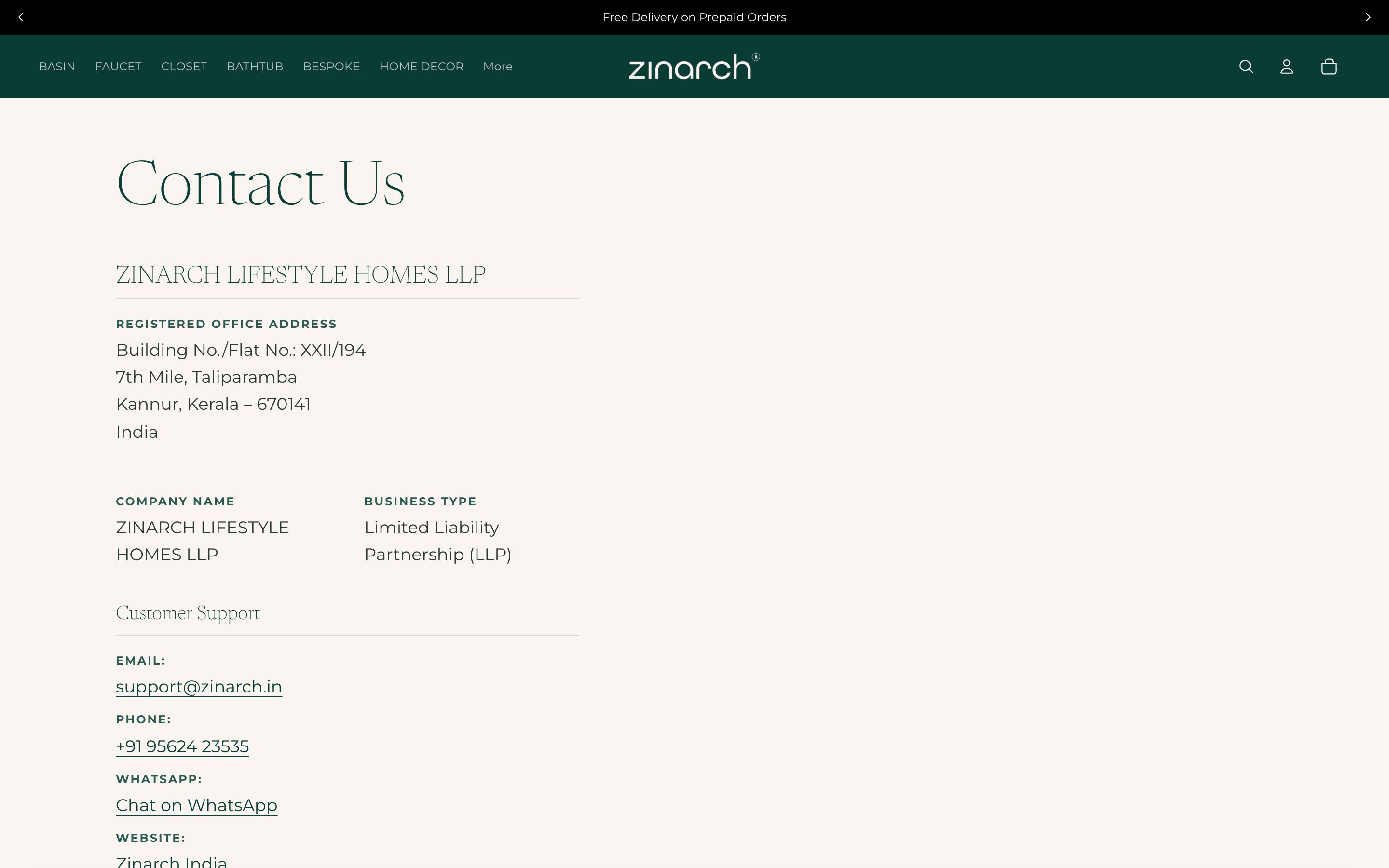
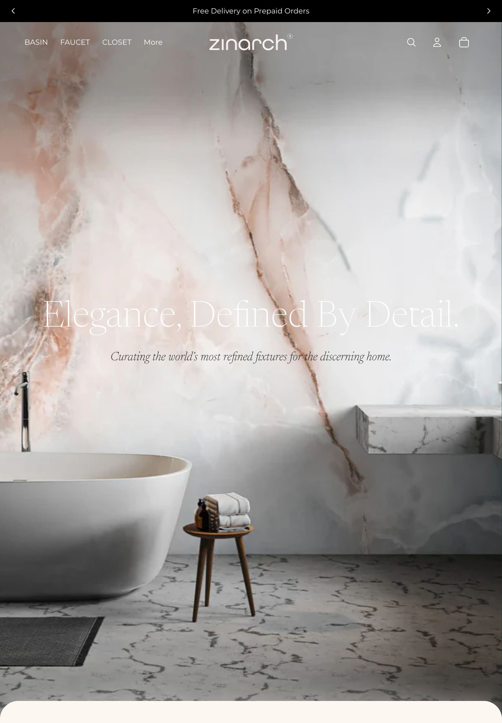
Zinarch curates the world's most refined bathroom fixtures and home objects for discerning Indian homes. The store had to feel like a design gallery, letting the craftsmanship of each product fill the frame.
- Client
- Zinarch
- Industry
- Luxury Home & Fixtures
- Year
- 2026
- Services
- UX & UI Design, E-commerce Build, Catalogue Architecture, Front-end Development
Pages we designed & built
Not a one-page template - a full site. Here are the real, live pages we designed and developed, each with its own layout and job to do.
The brief
A luxury fixtures buyer is paying for taste and detail. A busy, discount-driven storefront would have undercut the entire proposition. The site needed the restraint of a gallery and the rigour of a real e-commerce catalogue.
The thinking
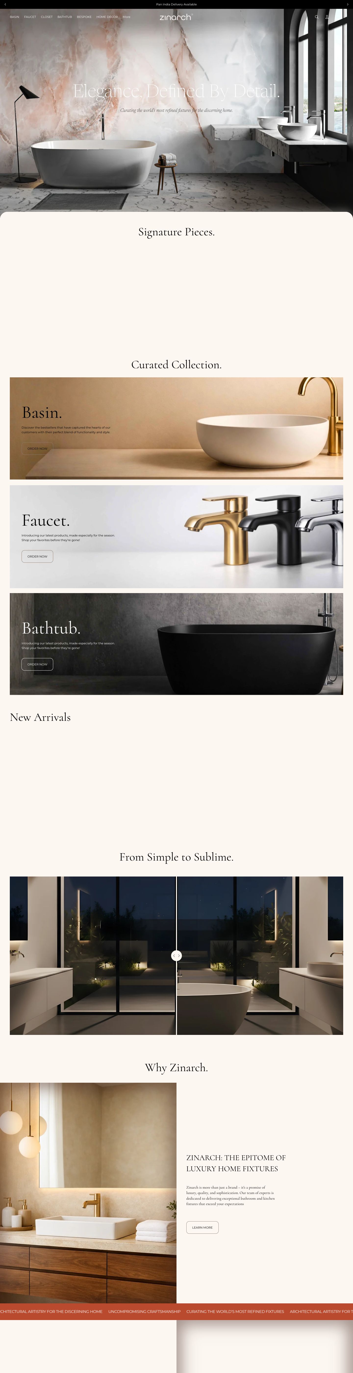
Monochrome as luxury
We built the store in near-monochrome - warm stone, deep ink, white - so nothing competes with the product. Restraint is the signal: it tells a discerning buyer this is a curated gallery, not a marketplace.
Brass as the only metal
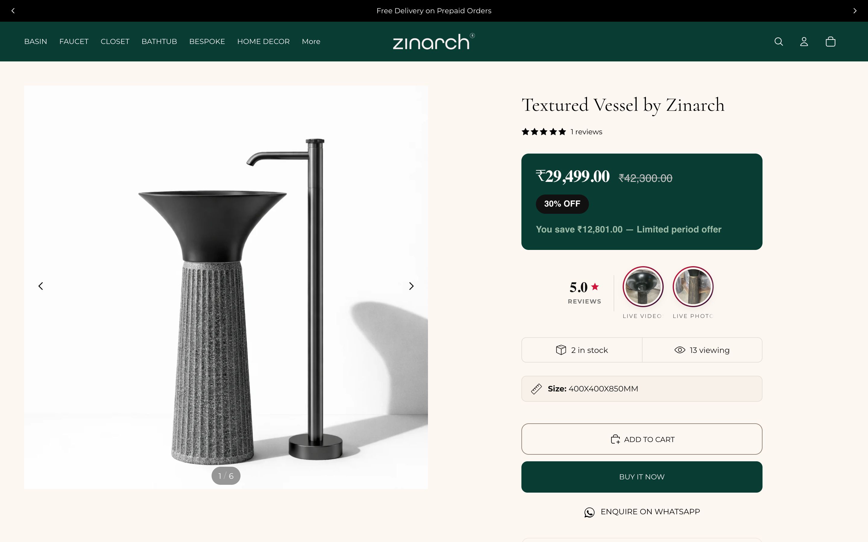
A single warm brass accent runs through buttons and details - echoing the premium metals of the fixtures themselves and giving the palette its one note of warmth.
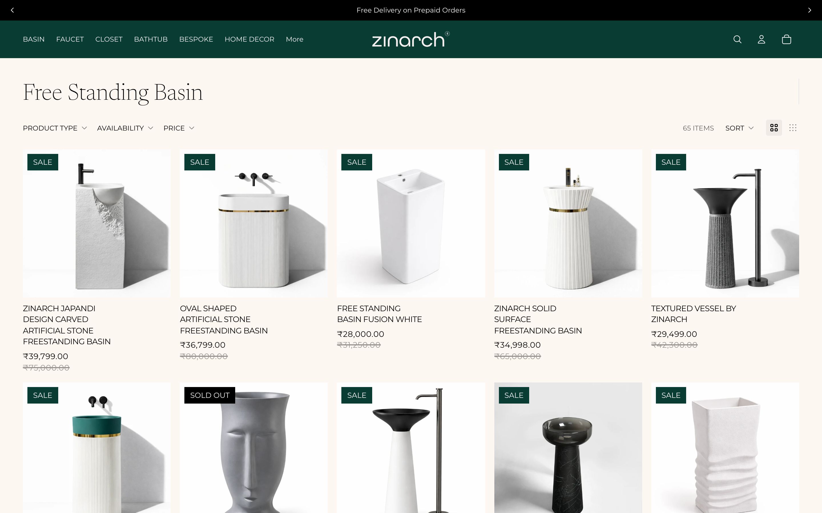
Catalogue with breathing room
Generous grids, large imagery and quiet typography let each object stand alone. Categories are clear and scalable, so the catalogue grows without ever feeling crowded.
Colour & meaning
Every colour was chosen for a reason - what it signals to the visitor and how it makes them feel before they read a single word.
Near-black for type and detail - the gallery wall against which products are hung.
A soft, architectural background that feels like concrete and natural stone, not sterile white.
The single metallic accent, echoing premium fixtures and adding the one warm note in a restrained palette.
A clean canvas for product photography so craftsmanship and finish read clearly.
Built for every screen
Designed mobile-first and engineered to look sharp on every device - the same live site on desktop, tablet and phone.
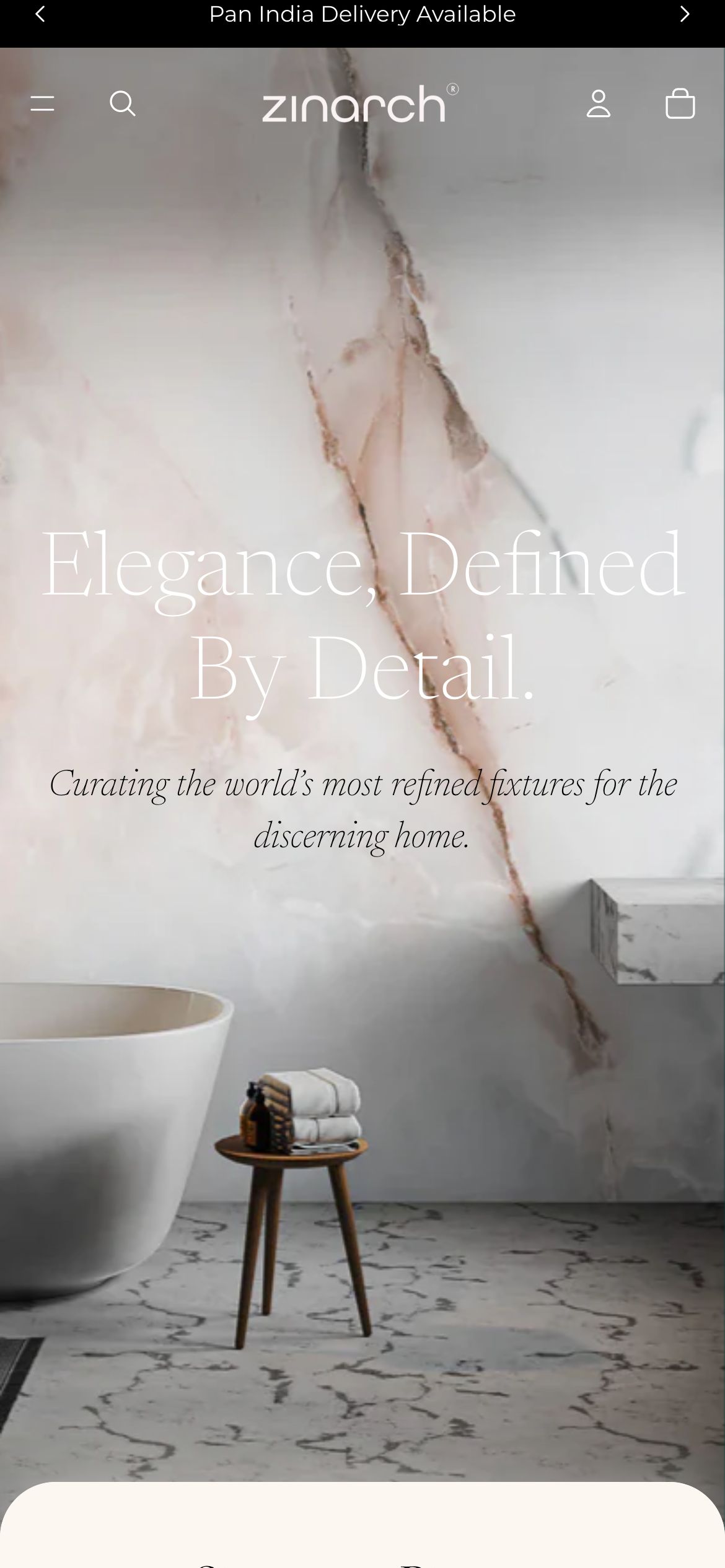
And every page is tuned for the phone - where most of these visitors actually land.
Home
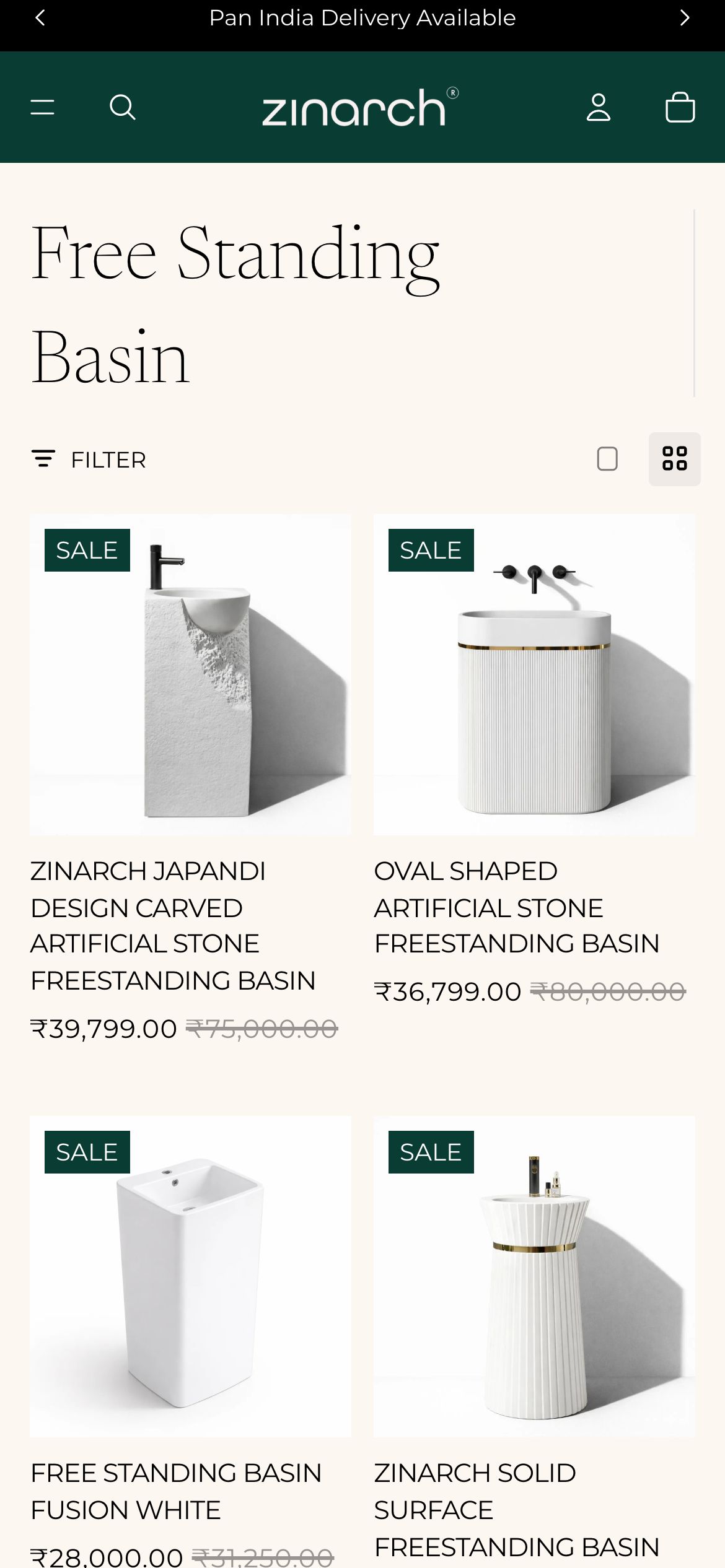
Collection
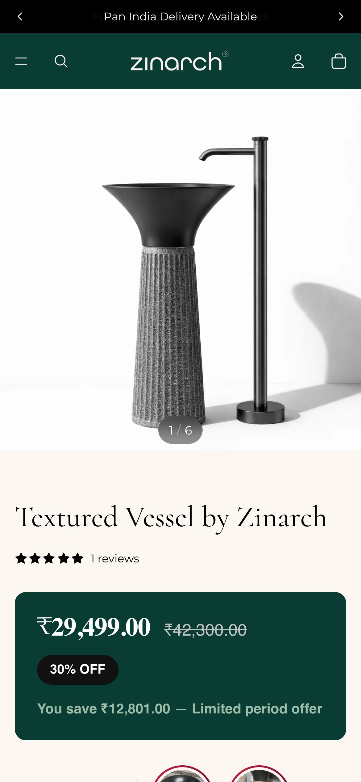
Product
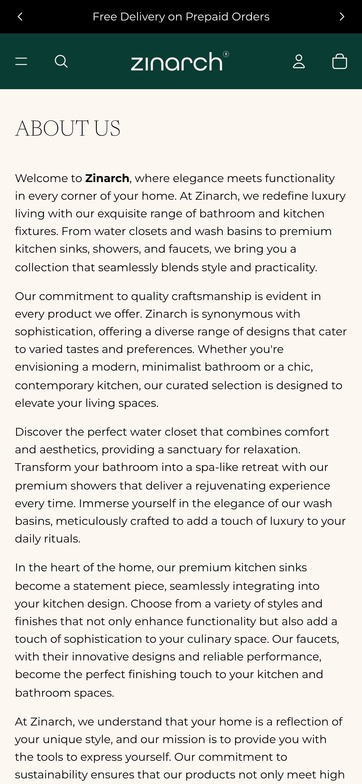
About
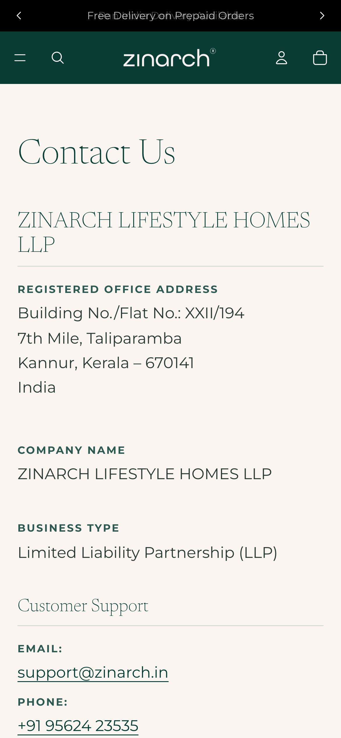
Contact
The full homepage, top to bottom
The complete homepage we shipped - scroll inside the frame to see every section, exactly as it went live.
Homepage on mobile
What we shipped
Pages shipped
“The store feels like walking into a design gallery. Nothing shouts, everything is considered - which is exactly how our customers expect to shop for pieces like these.”