Carlington
Premium styling at an accessible price - a storefront built to win the mobile shopper
Carlington sells fashion-forward watches for men, women and children with 7 lakh+ happy customers. The store had to make affordable watches feel genuinely premium and convert a largely mobile, impulse-driven audience.
- Client
- Carlington
- Industry
- Fashion · Watches
- Year
- 2026
- Services
- E-commerce UX & UI, Storefront Build, Conversion Optimisation, Front-end Development
Pages we designed & built
Not a one-page template - a full site. Here are the real, live pages we designed and developed, each with its own layout and job to do.
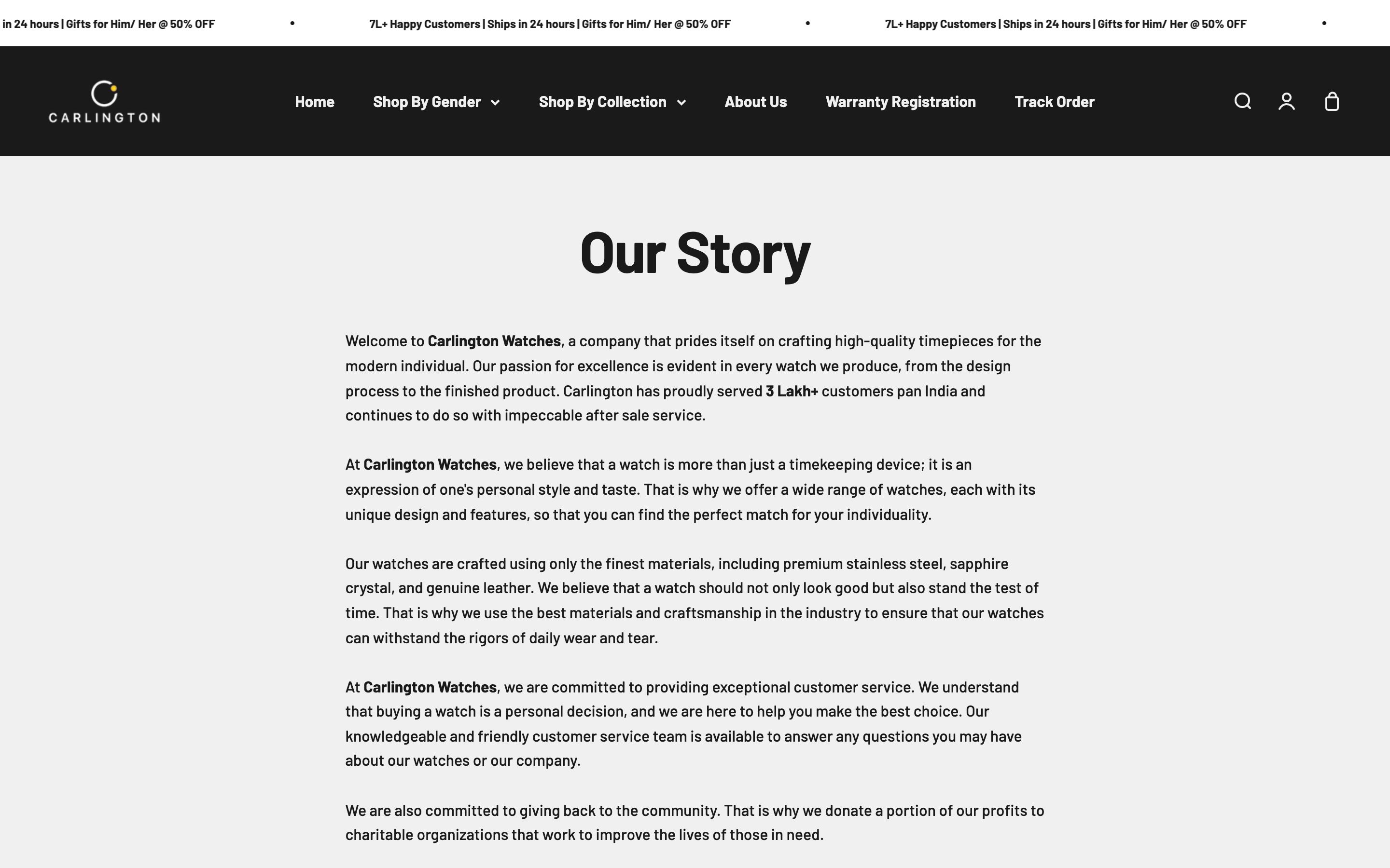
The brief
Carlington competes on style and value, but 'affordable' must never read as 'cheap'. The store had to feel boutique and aspirational, while ruthlessly optimising the fast, mobile, deal-driven path to checkout.
The thinking
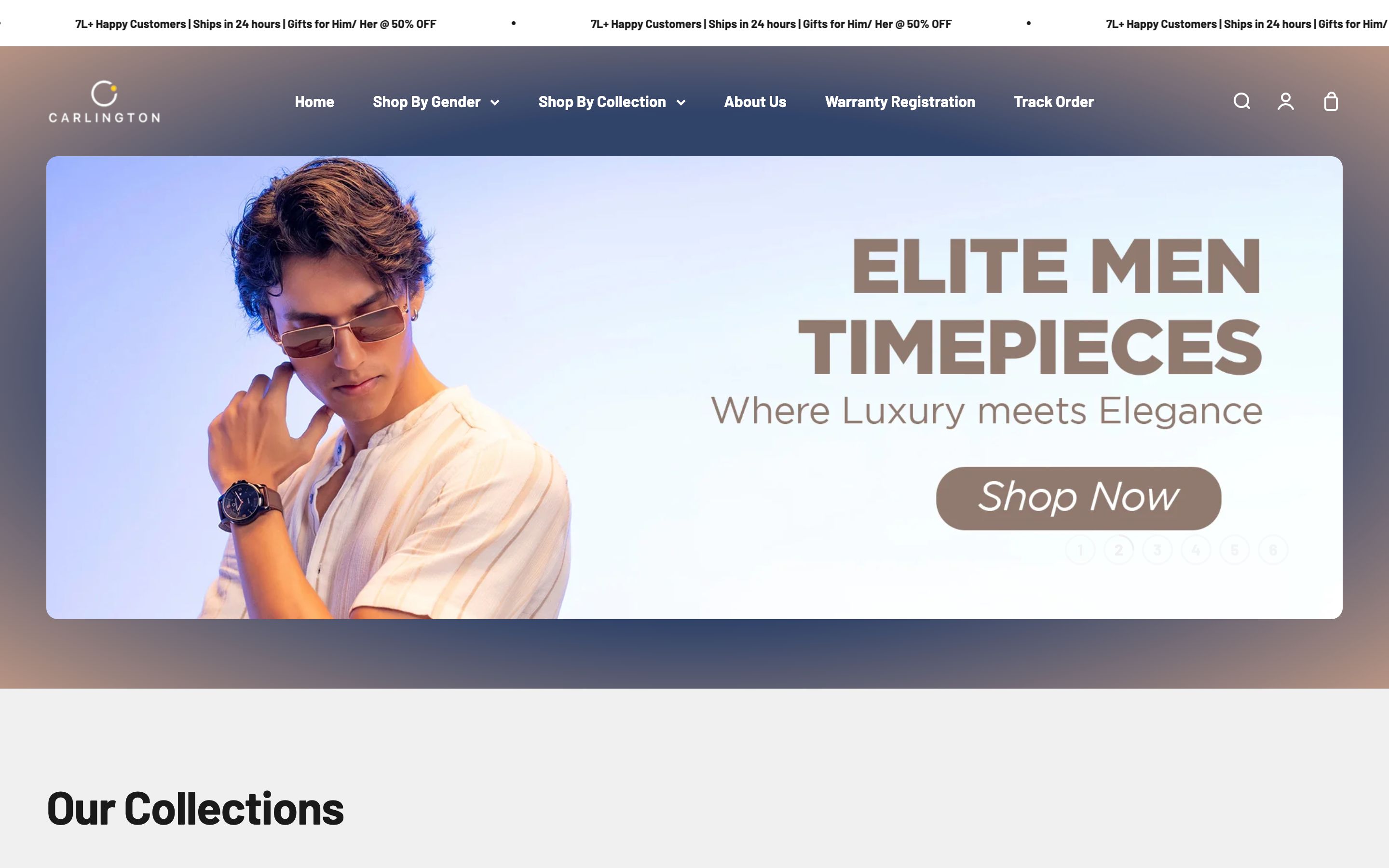
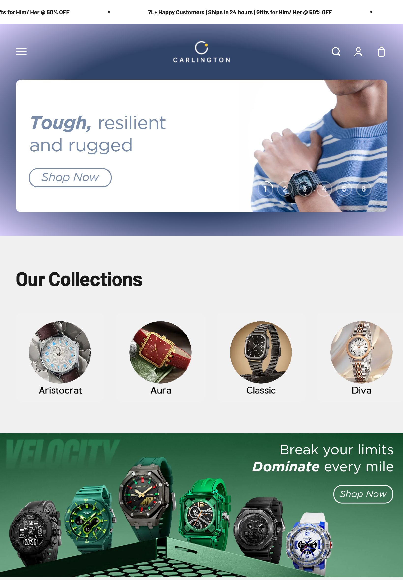
Navy and gold for premium
We dressed the store in deep navy and gold - the language of evening formalwear and fine timepieces. It makes accessible watches read as boutique and lets product photography and metallics pop.
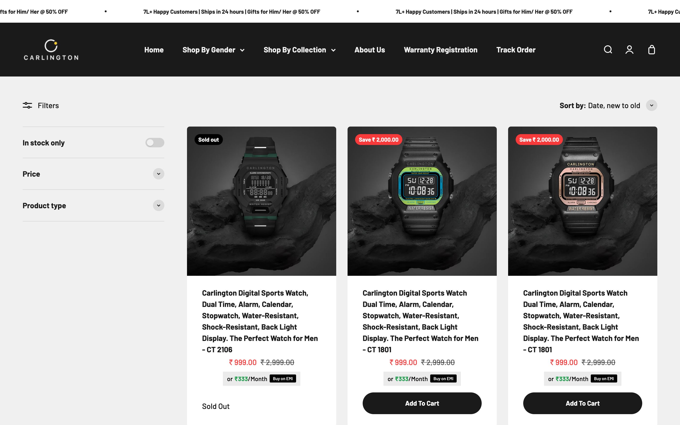
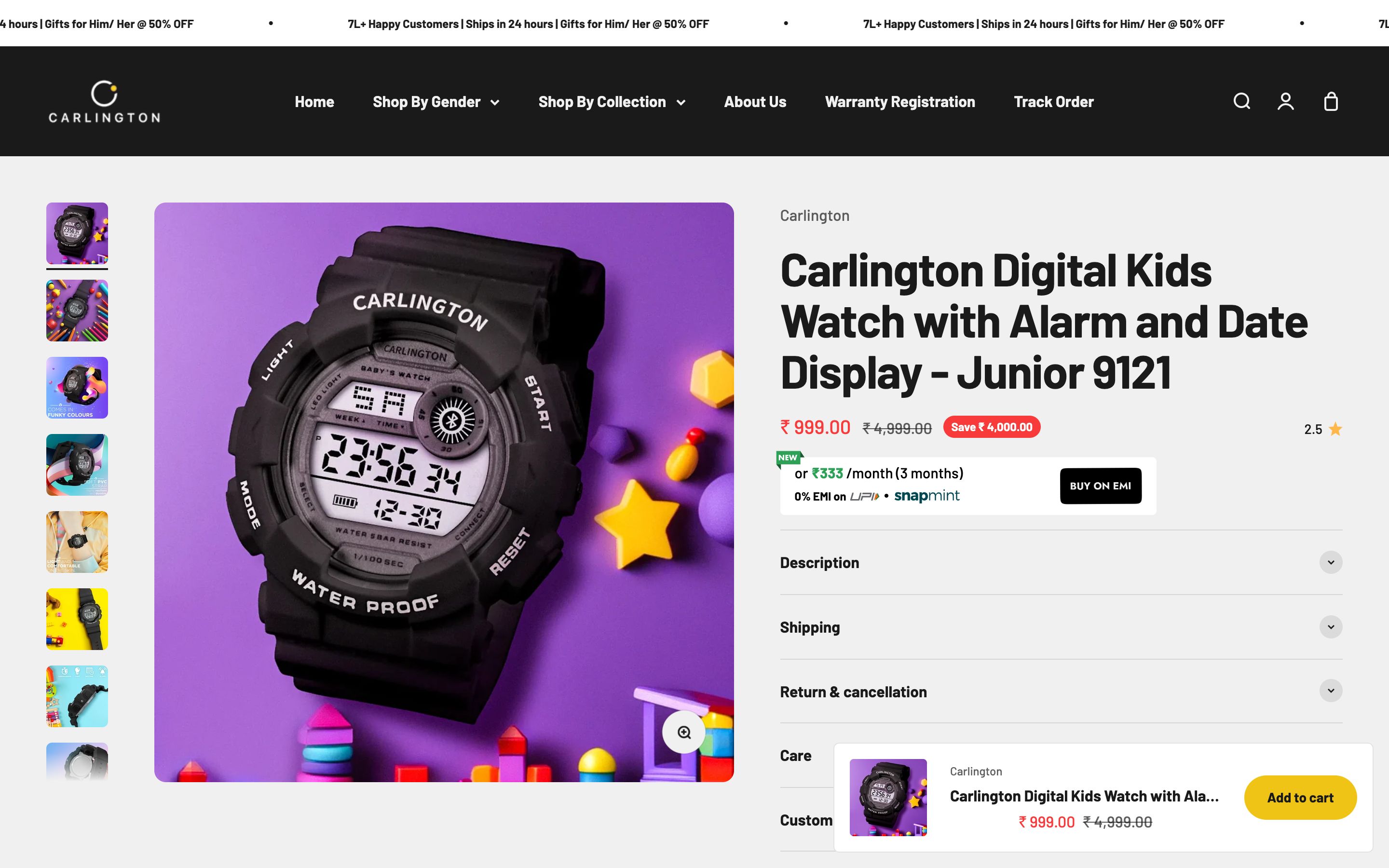
Mobile-first, conversion-first
Every decision served the mobile shopper: thumb-friendly product cards, fast collection browsing, sticky add-to-cart and a short, confident checkout tuned for impulse purchases.
Tasteful offers
Discounts are framed as boutique value rather than fire-sale, and trust cues - 7L+ customers, warranty, 24-hour shipping - are surfaced so price-sensitive shoppers buy with confidence.
Colour & meaning
Every colour was chosen for a reason - what it signals to the visitor and how it makes them feel before they read a single word.
The colour of evening formalwear and luxury - it makes affordable watches feel premium and lets gold and metallics shine.
Craftsmanship and value - the metallic of a quality timepiece, signalling premium at an accessible price.
A warm, breathing canvas so products feel boutique and considered, never cluttered.
A clean product stage that keeps dials, straps and finishes crisp.
Built for every screen
Designed mobile-first and engineered to look sharp on every device - the same live site on desktop, tablet and phone.
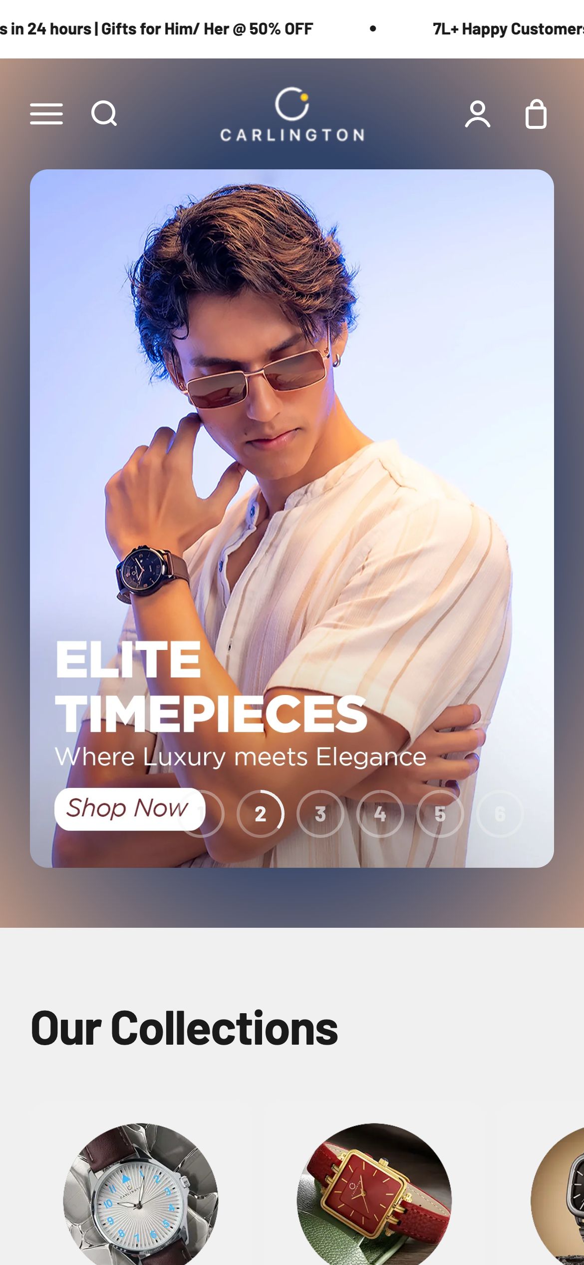
And every page is tuned for the phone - where most of these visitors actually land.
Home
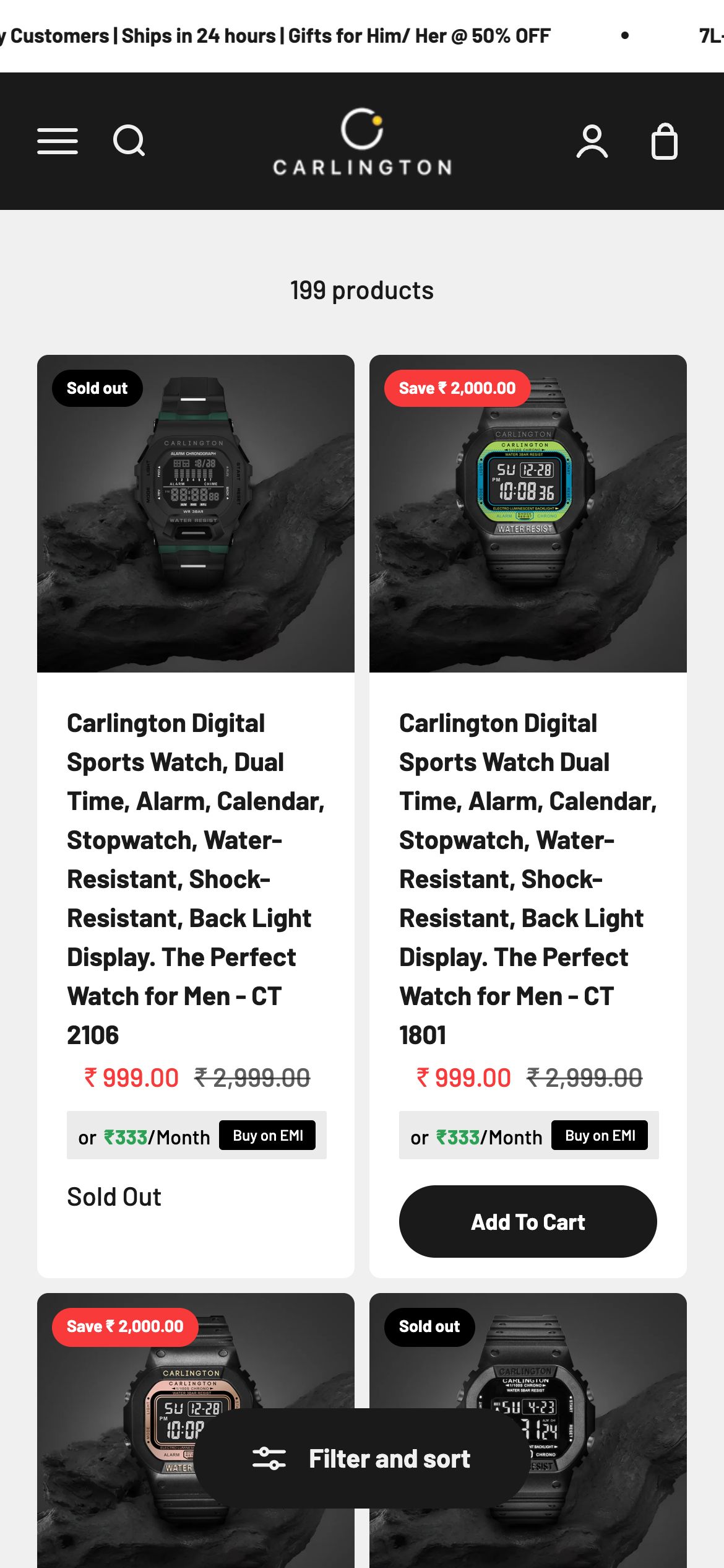
Collection
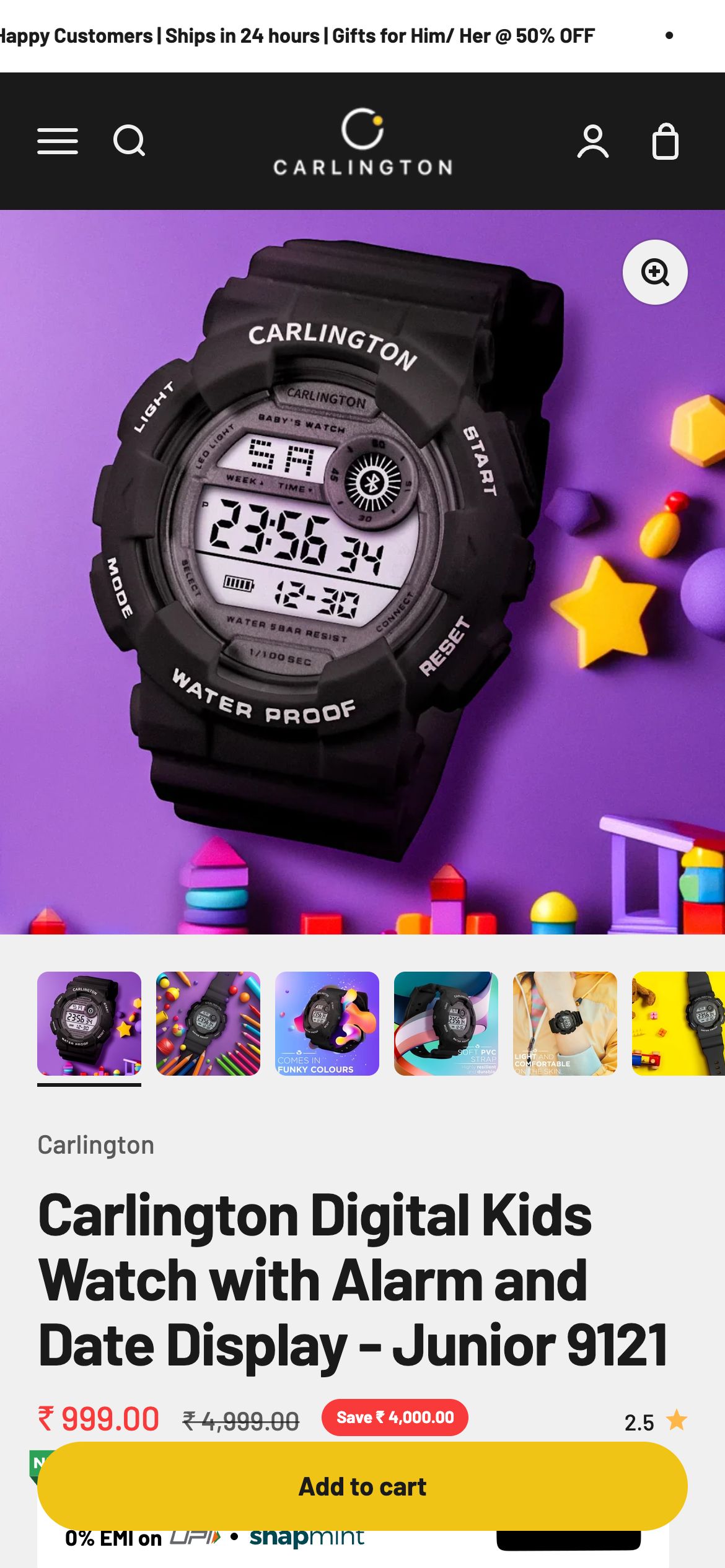
Product
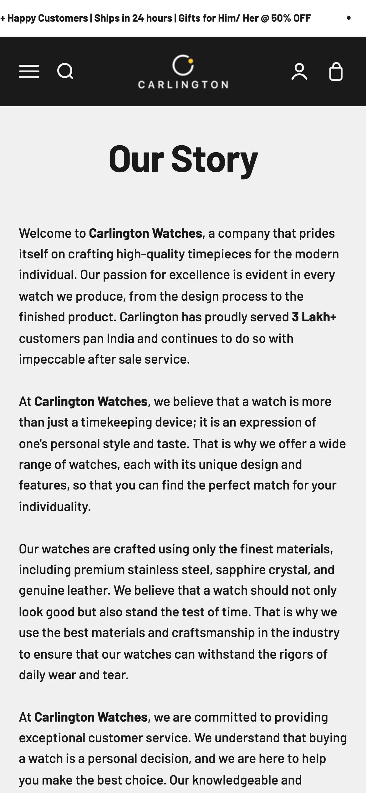
About
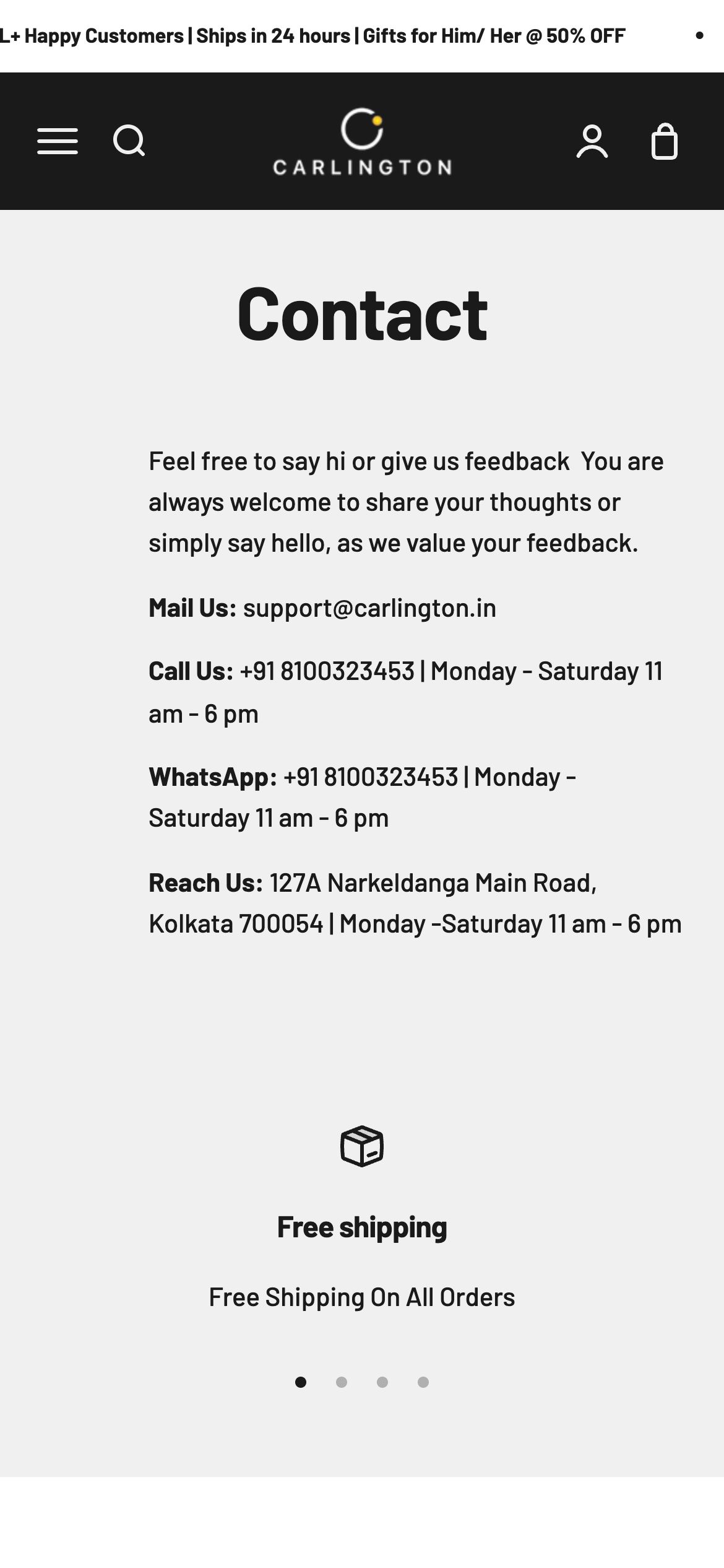
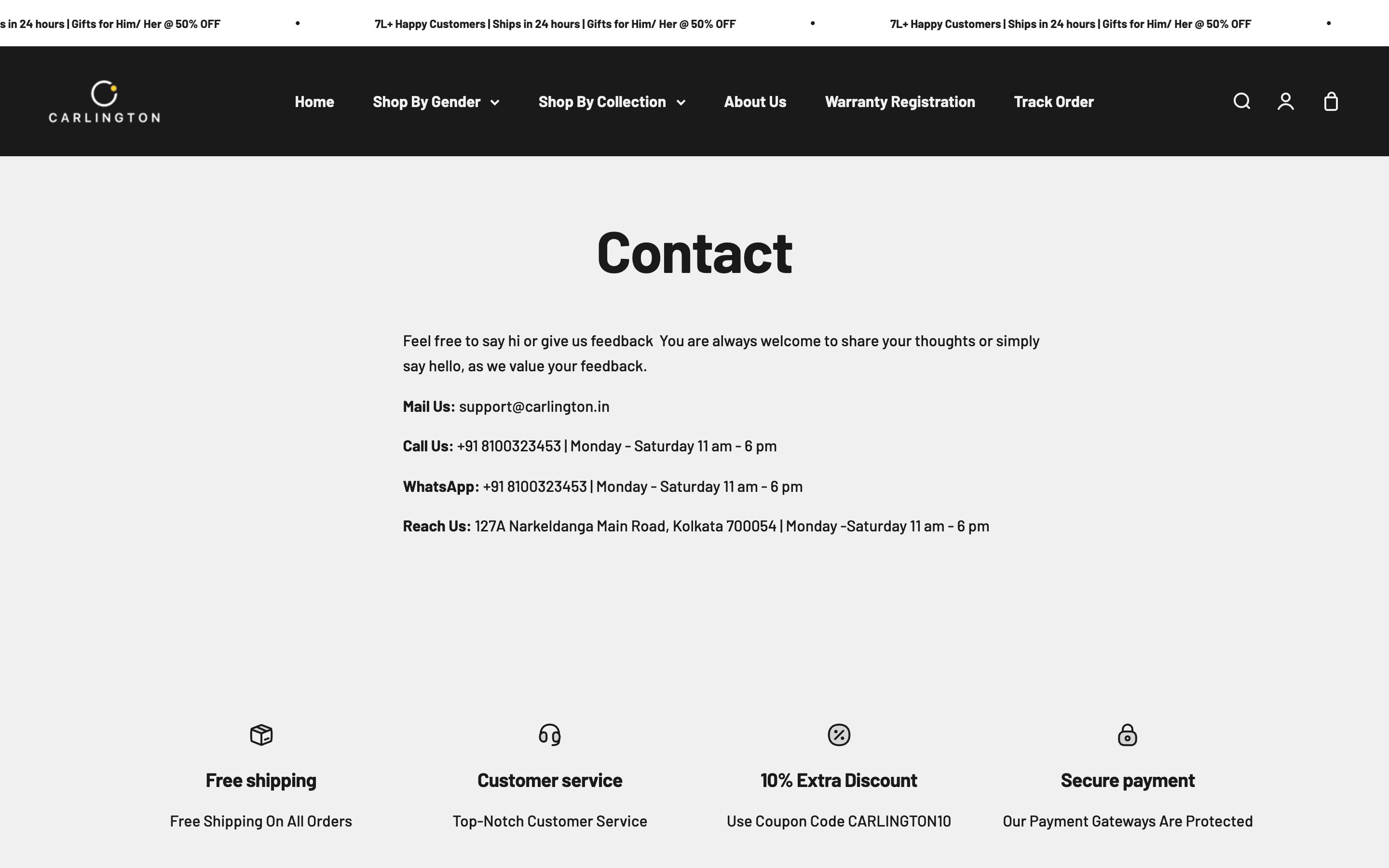
Contact
The full homepage, top to bottom
The complete homepage we shipped - scroll inside the frame to see every section, exactly as it went live.
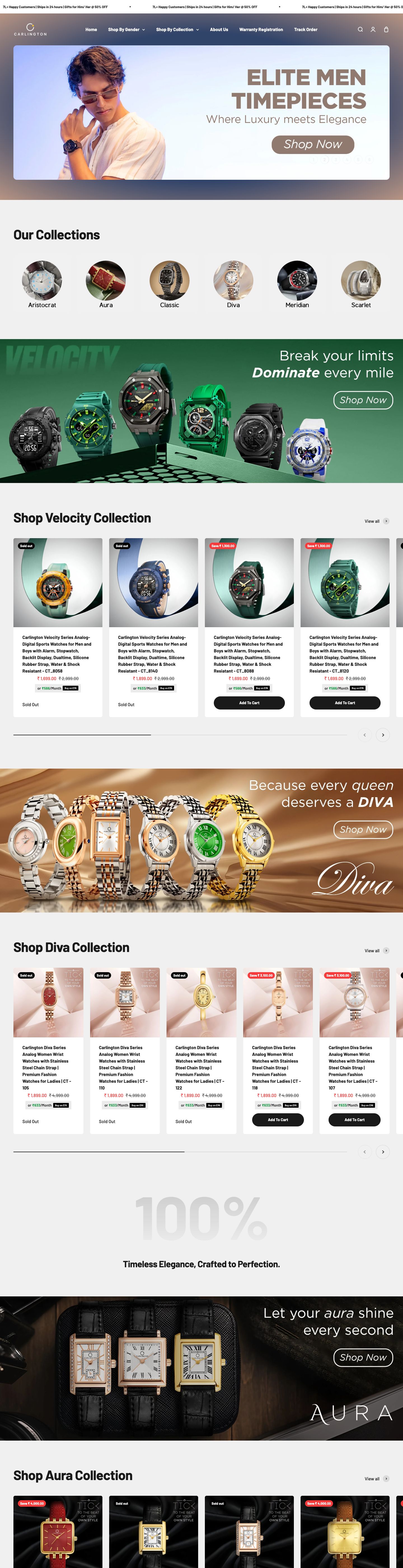
Homepage on mobile
What we shipped
Pages shipped
“The store makes our watches look every bit as good as brands costing five times more. It is fast, it sells, and it finally matches the quality our customers find on the wrist.”