Paankhuri
A garden store that feels made by real gardeners, for real gardeners
Paankhuri is positioned as India's number-one garden-care store, selling rare bulbs and seeds, tools and plant care. The store had to feel warm and trustworthy for beginners while organising a deep, seasonal catalogue without clutter.
- Client
- Paankhuri
- Industry
- Gardening · D2C
- Year
- 2026
- Services
- UX & UI Design, Catalogue Architecture, E-commerce Build, Front-end Development
Pages we designed & built
Not a one-page template - a full site. Here are the real, live pages we designed and developed, each with its own layout and job to do.
The brief
Gardening is equal parts hope and uncertainty - especially for beginners. The store had to feel encouraging and 'made by real gardeners', while taming a sprawling catalogue of bulbs, tools and plant care into something easy to browse and seasonal to shop.
The thinking
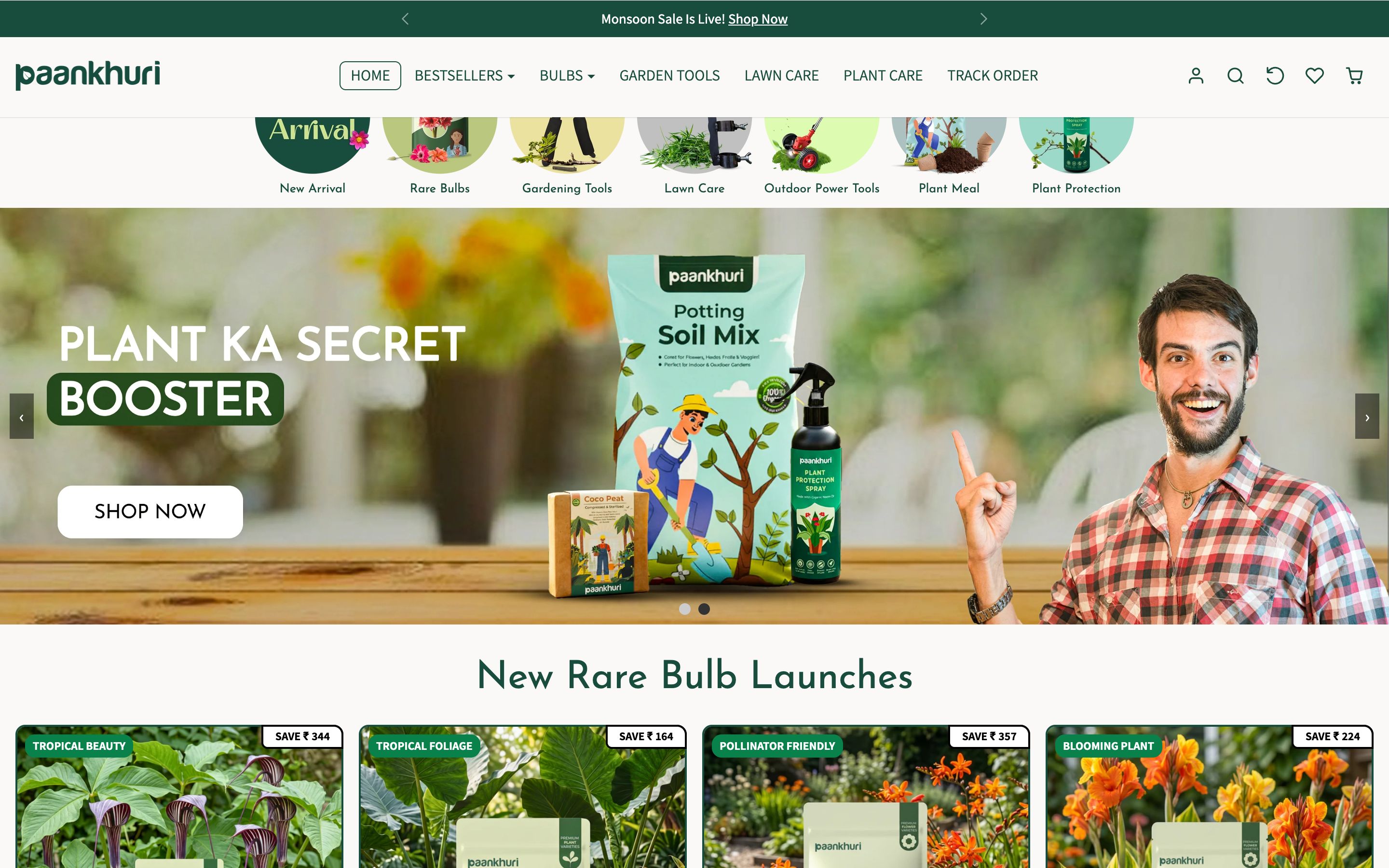
Earthy and encouraging
We built the palette from garden green and warm soil, with a terracotta accent for energy - the colours of growing things. It feels natural and reassuring, the way a good gardener makes a beginner feel capable.
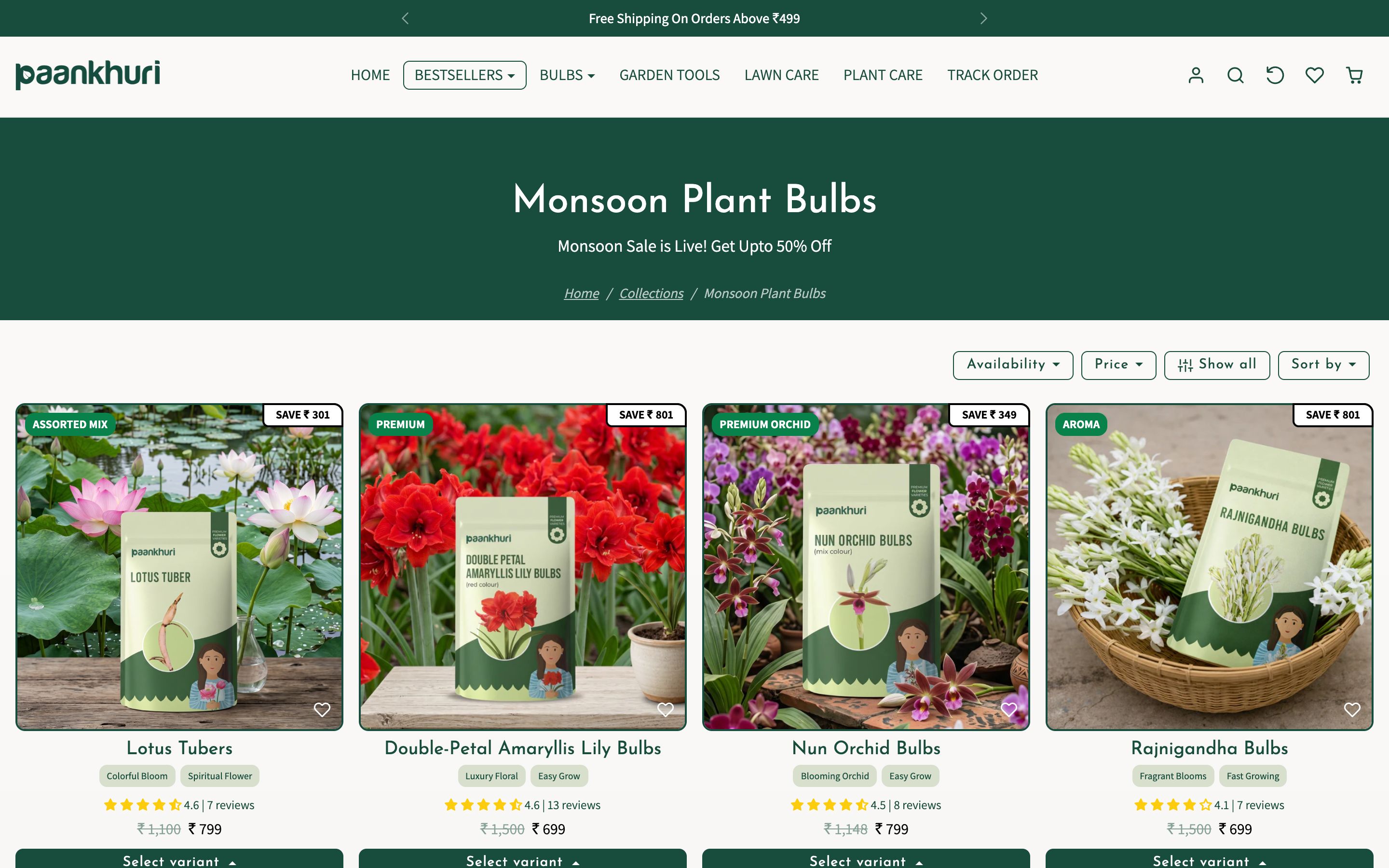
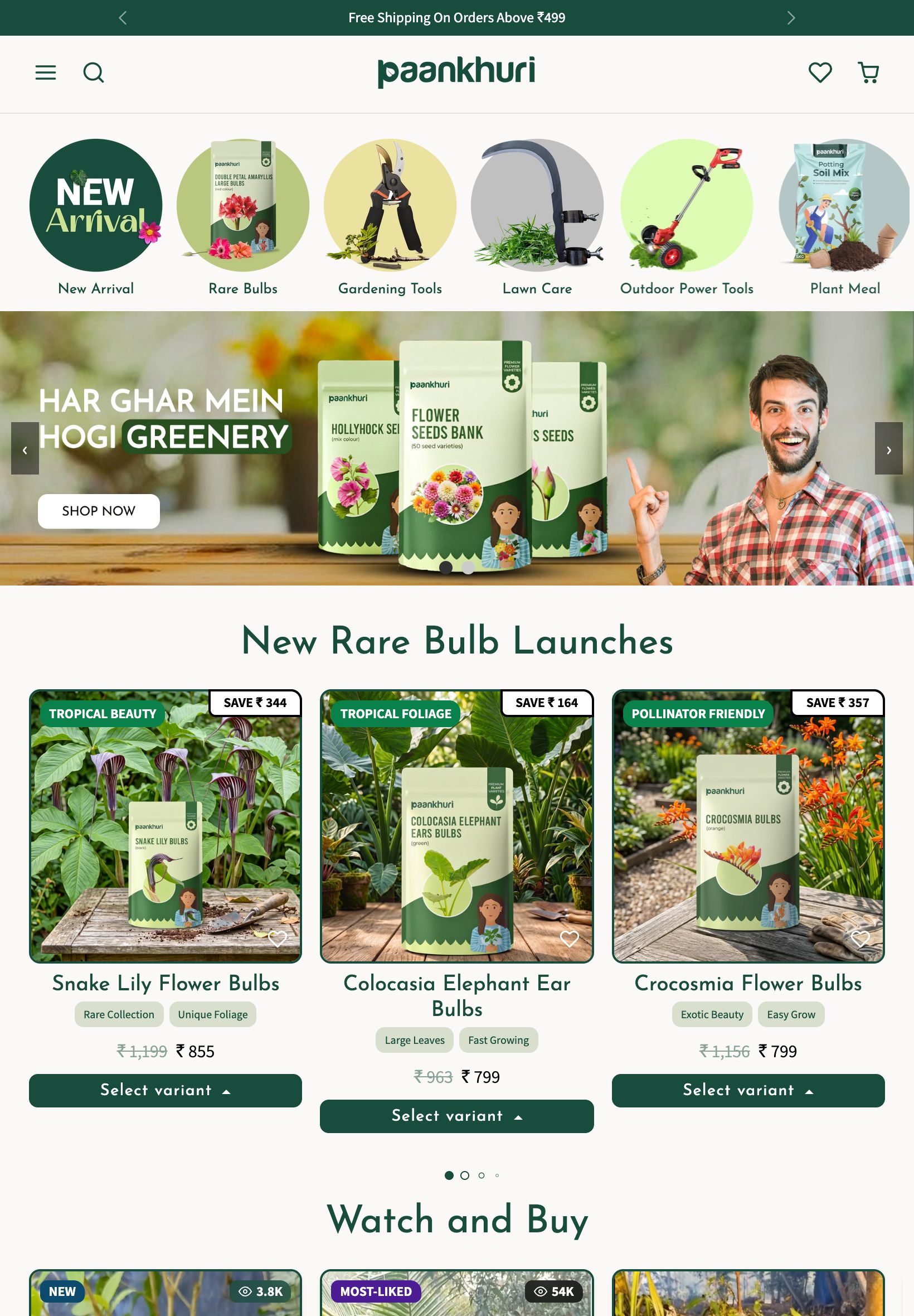
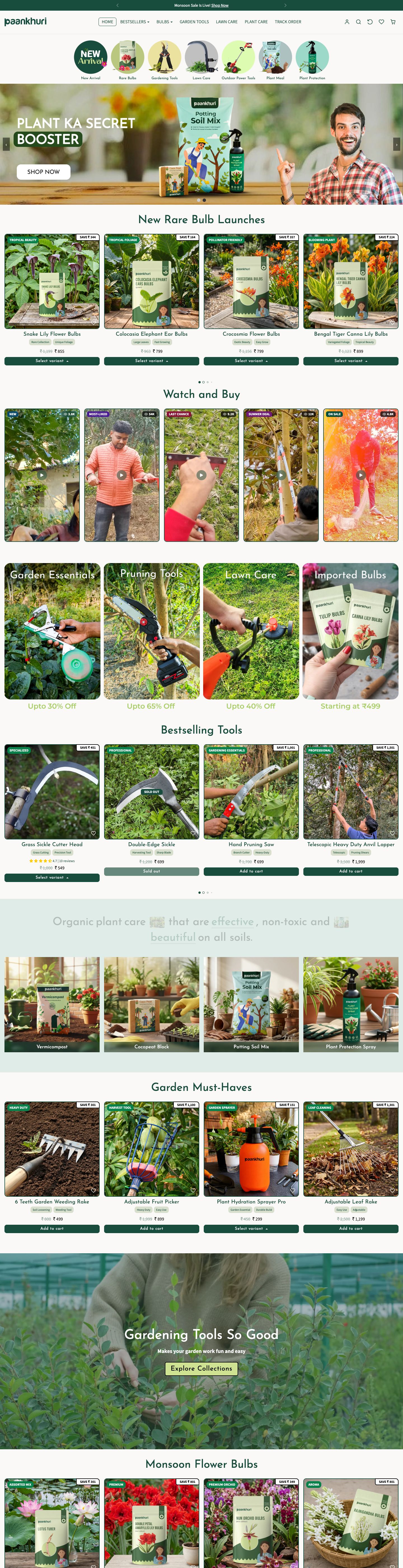
A catalogue that breathes
Bestsellers, bulbs, tools, lawn and plant care are organised into clear, scannable categories with seasonal edits up front, so a sprawling range feels curated and easy to navigate.
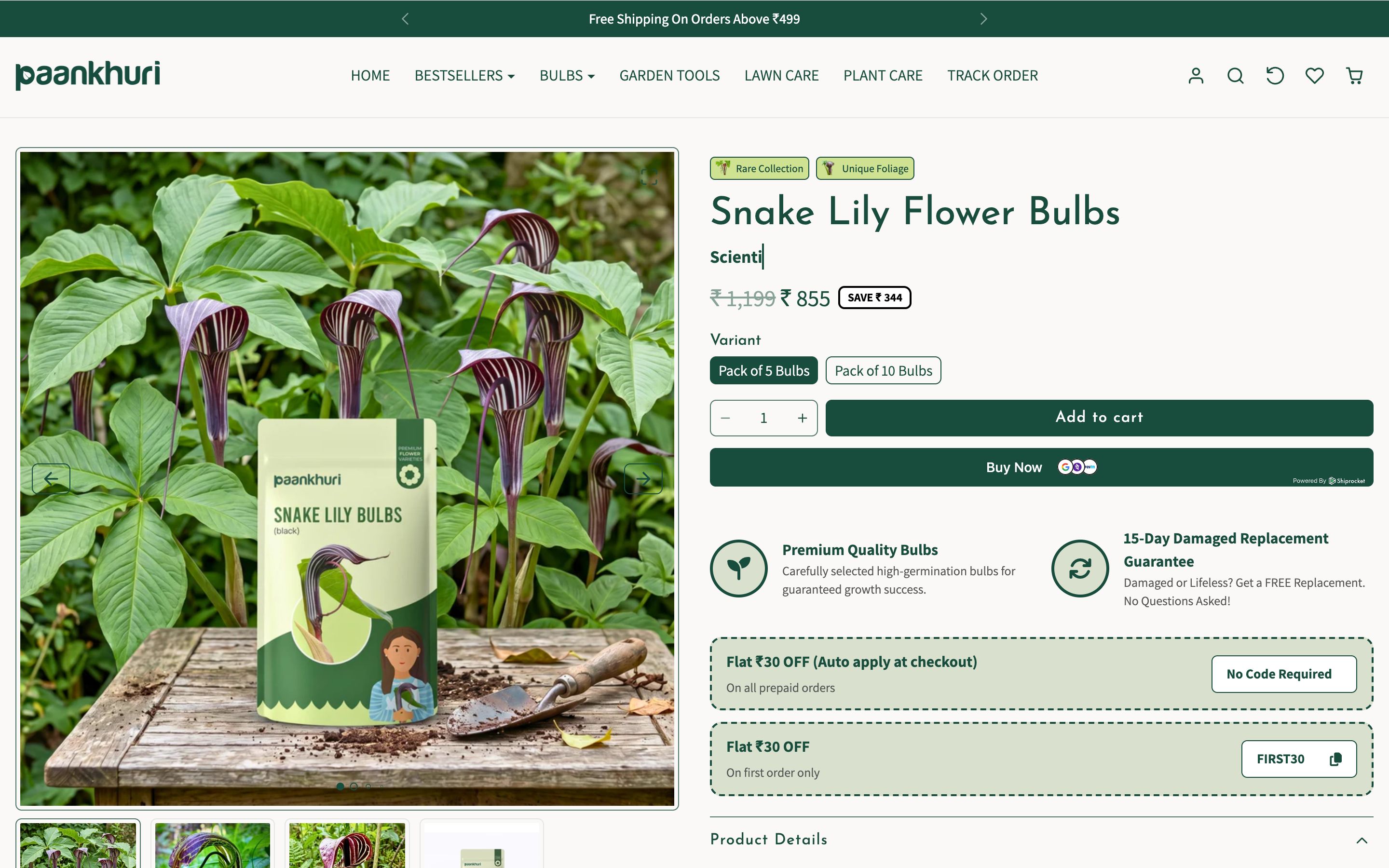
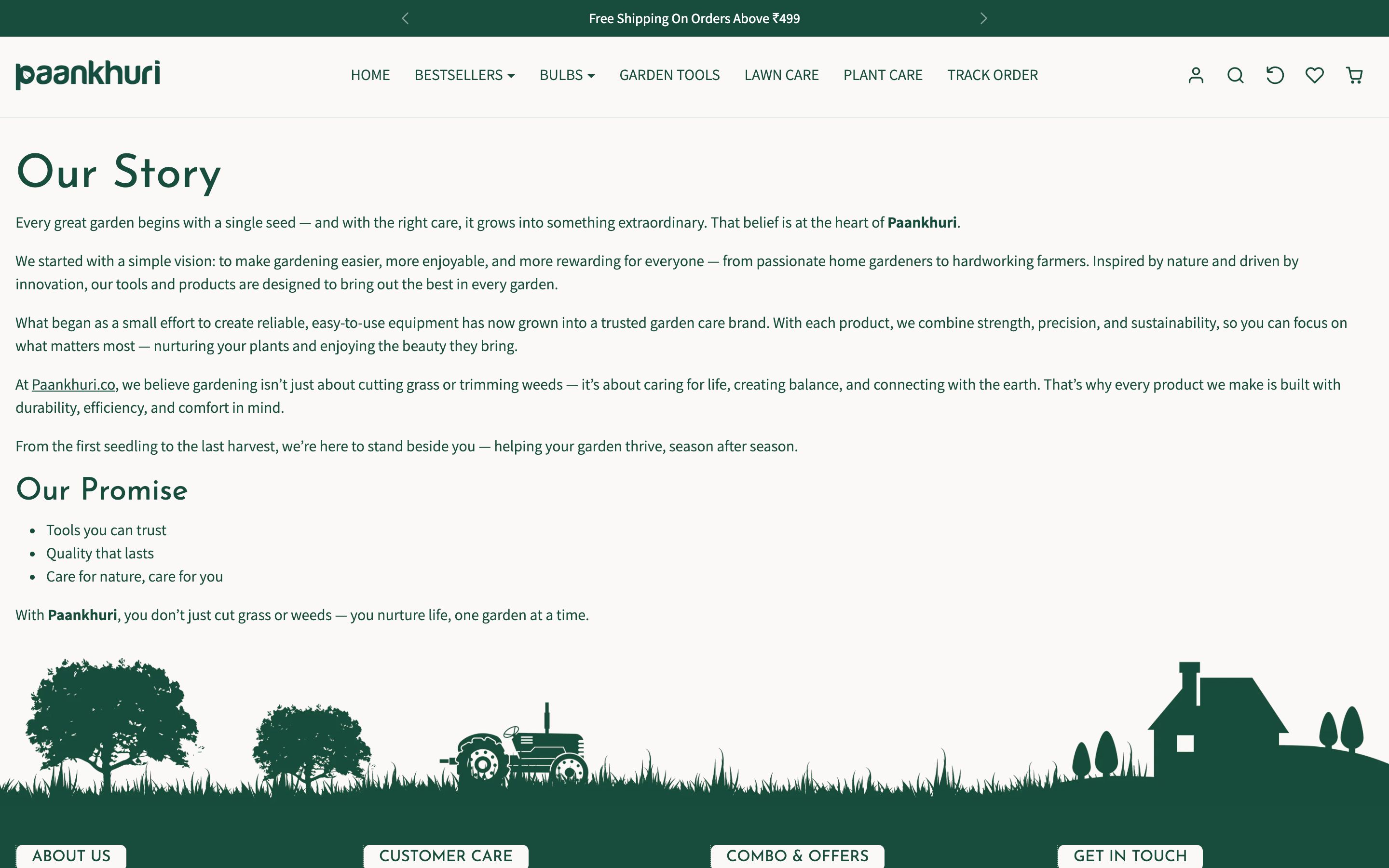
Trust, made by real gardeners
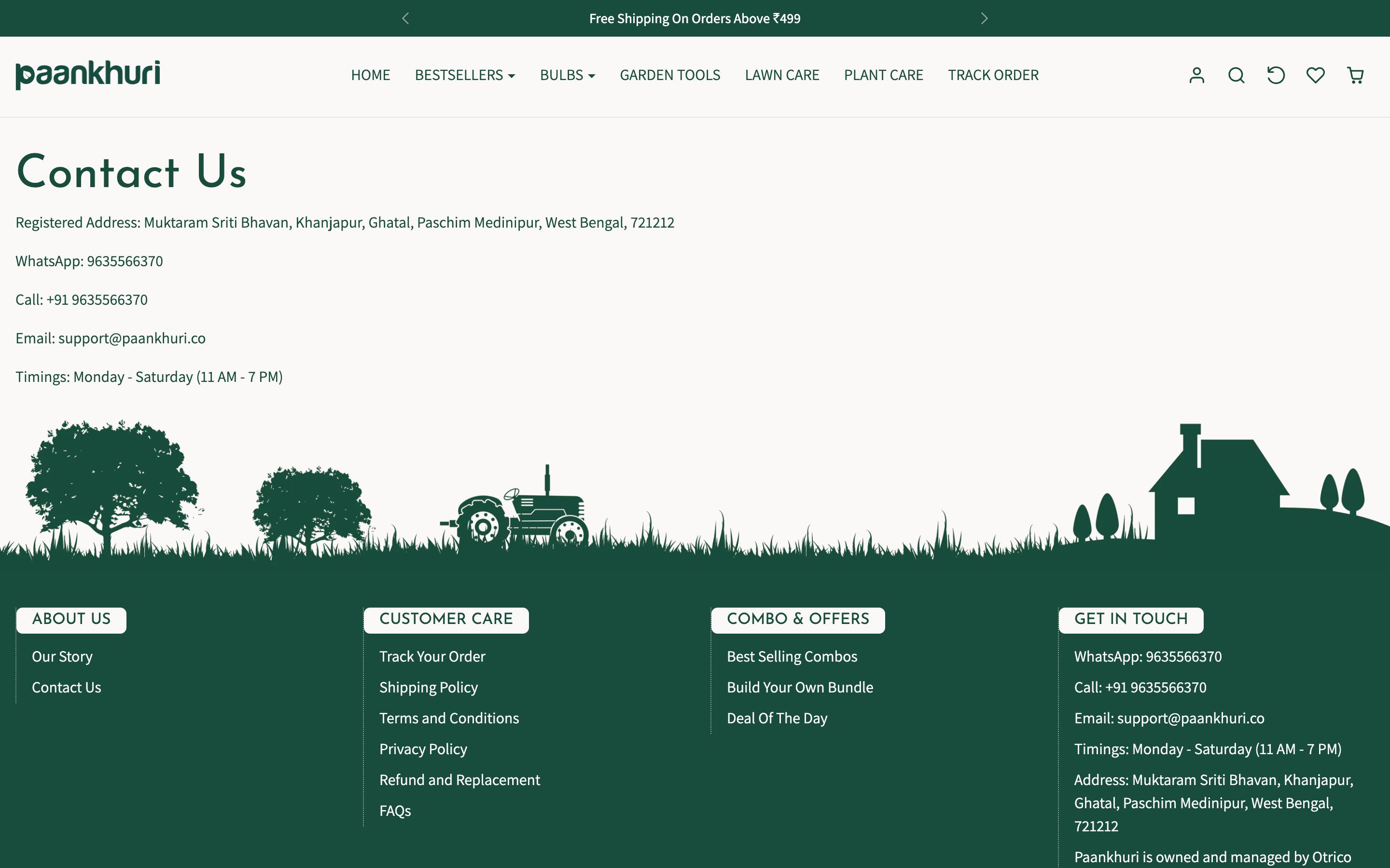
The 'made by real gardeners' promise, 1L+ happy gardeners and easy returns are woven through the experience, so a first-time buyer trusts both the products and the advice behind them.
Colour & meaning
Every colour was chosen for a reason - what it signals to the visitor and how it makes them feel before they read a single word.
Growth, life and reassurance - the colour of healthy plants and the heart of the brand.
Earthy, grounded warmth that makes the store feel natural and hands-in-the-dirt real.
A warm, energetic accent for offers and seasonal edits, drawn from clay pots and blooms.
A soft, natural background that keeps a deep catalogue light and easy to browse.
Built for every screen
Designed mobile-first and engineered to look sharp on every device - the same live site on desktop, tablet and phone.
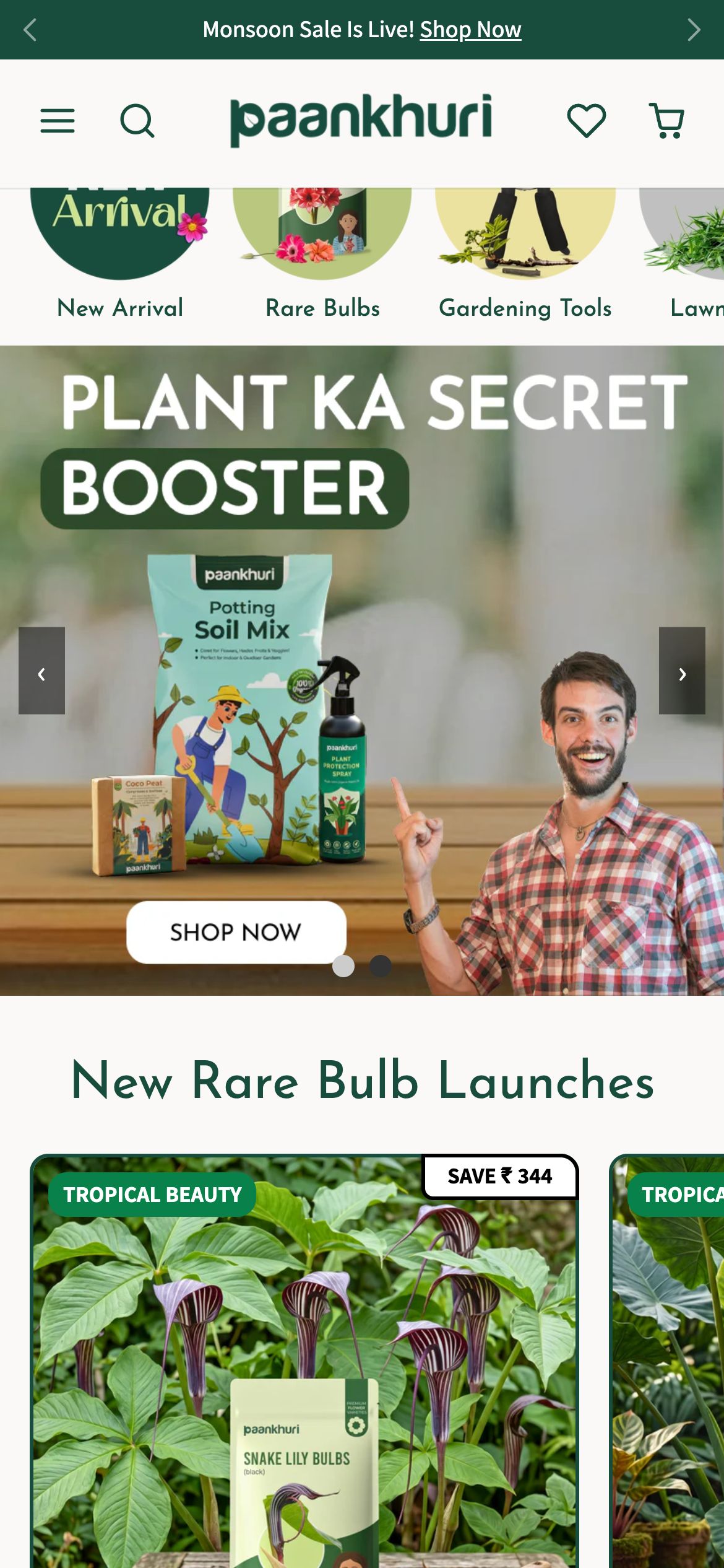
And every page is tuned for the phone - where most of these visitors actually land.
Home
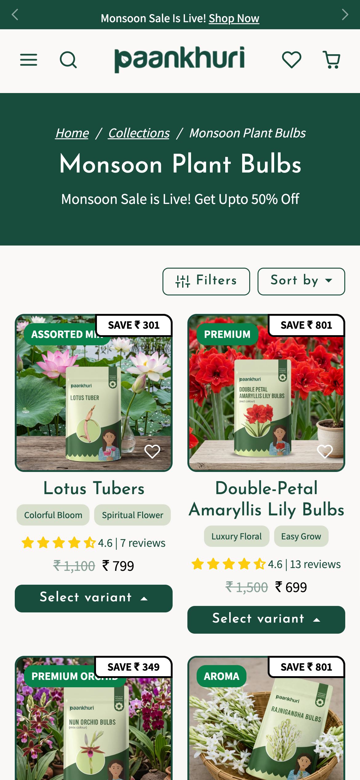
Collection
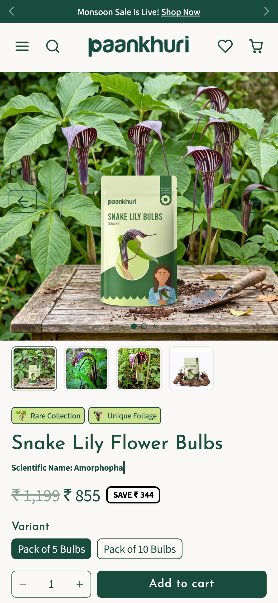
Product
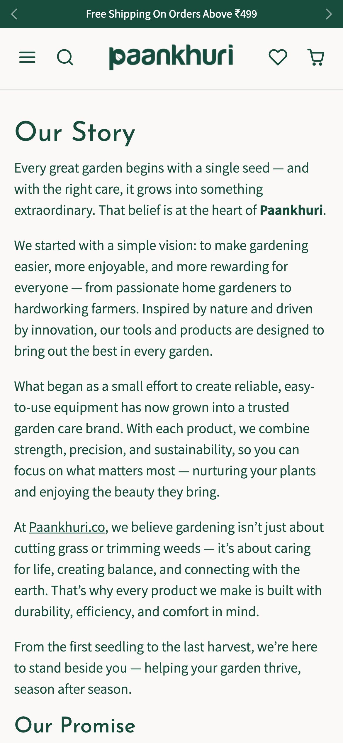
Story
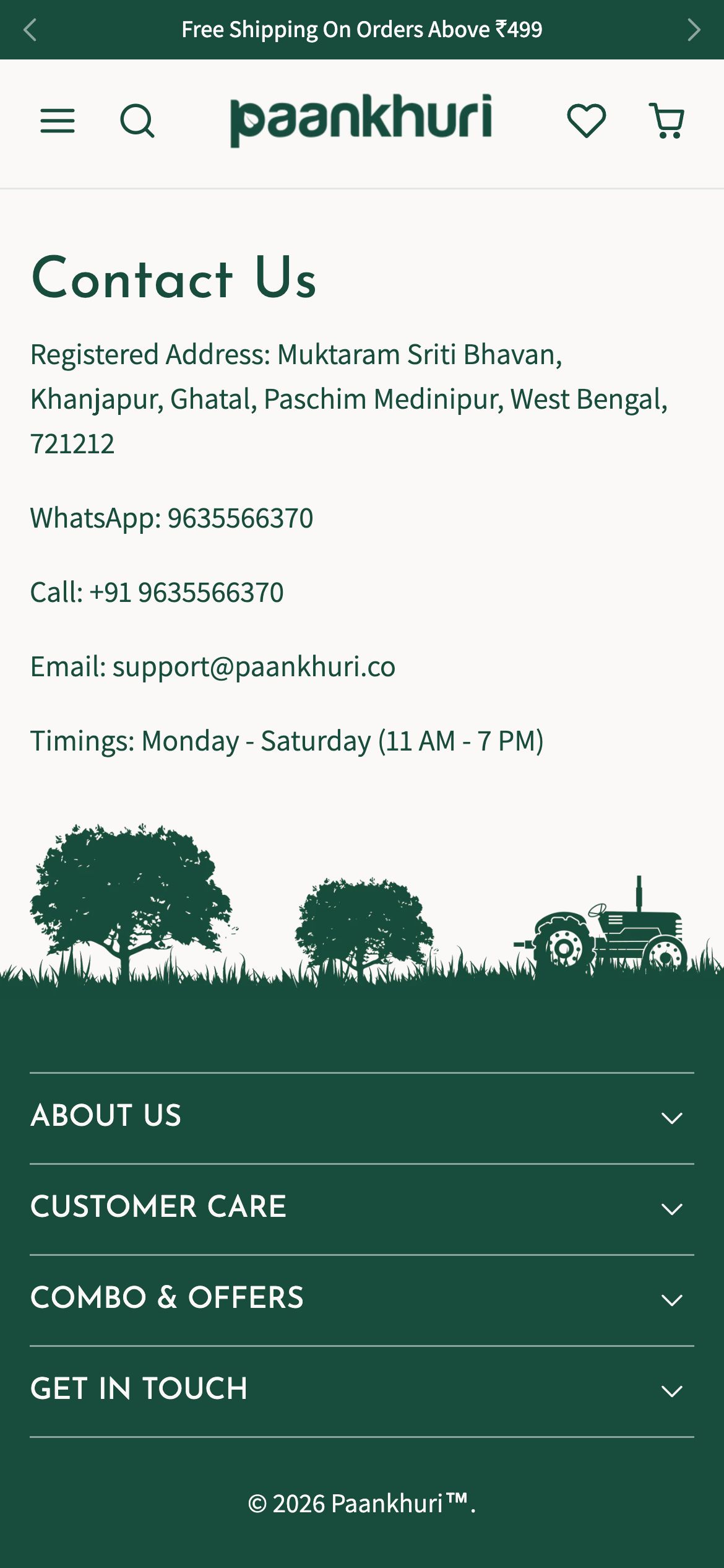
Contact
The full homepage, top to bottom
The complete homepage we shipped - scroll inside the frame to see every section, exactly as it went live.
Homepage on mobile
What we shipped
Pages shipped
“The store finally feels as friendly and knowledgeable as our team. Beginners aren't overwhelmed, our seasonal ranges sell, and people trust that real gardeners stand behind every product.”